A word about the Design
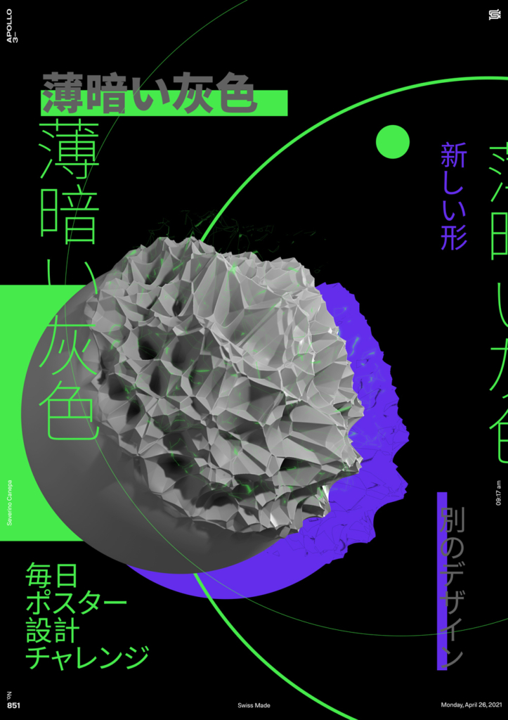
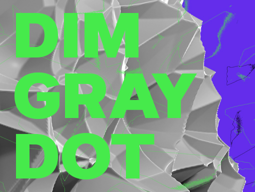
I made the design of this mini-series evolve with today’s poster. I created a new 3D dot in Blender that looks like an explosion. There is something about transformation with this round shape that is visually pleasant.
I like Japanese writing because I cannot read it well, but I understand there are many graphic qualities in these characters. I also want to place this text around the corners to make the poster less minimalistic.

