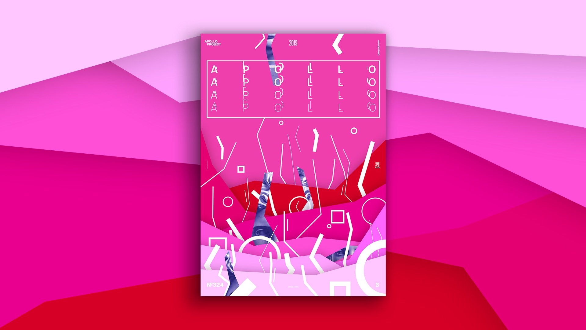
It was late this morning when I started to design a Digital Pink Poster. It was much later than usual, and it brought a bit of pressure because I knew I had to finish it quickly to start to work for my clients. I changed my habits because I did too much yesterday, which made my body need more rest.
The Design

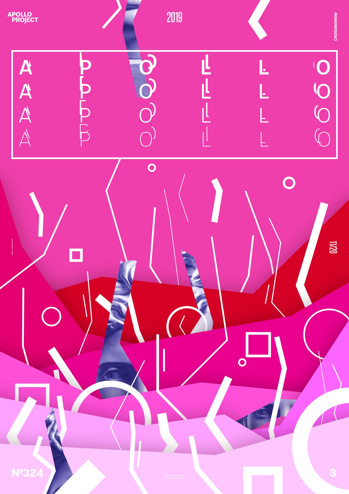
I introduce again the large rectangle on the top of the canvas I made with the first poster of the mini-series Digital + Color’s name. I thought he broke the composition visually, but it brought some benefits after an analysis. The biggest one is that it generates a quiet place where the eyes can rest.
That means it was an essential part of the design that I underestimated the first time only because of the wrong impression. This often happens when you don’t take the time or don’t have the time.
To be more original and avoid making my designs for the mini-series look the same, I used straight lines in the background but not for the white lines. I created them with two or three anchor points. They almost make you feel like a Memphis pattern. That’s my impression, of course.
I colored the picture of Apollo in blue as a contrast. That’s all about today’s poster.
Speed Art Poster #324
There is one more speed art video tutorial on YouTube. If you are interested in my creation process for this poster, take a look.
Don’t forget to come here again tomorrow for poster #325. Have a nice day!

