I woke up a bit late but early enough to see the sunrise. I noticed that the door of my room was only a little bit open. That allowed more than nine mosquitos to enter my room. I was surrounded by fat, big mosquitos full of my blood.
The Design

I wasn’t satisfied with the Digital Blue Poster I made yesterday. With this bad impression about the design, I tried to take my revenge today by creating a better design.
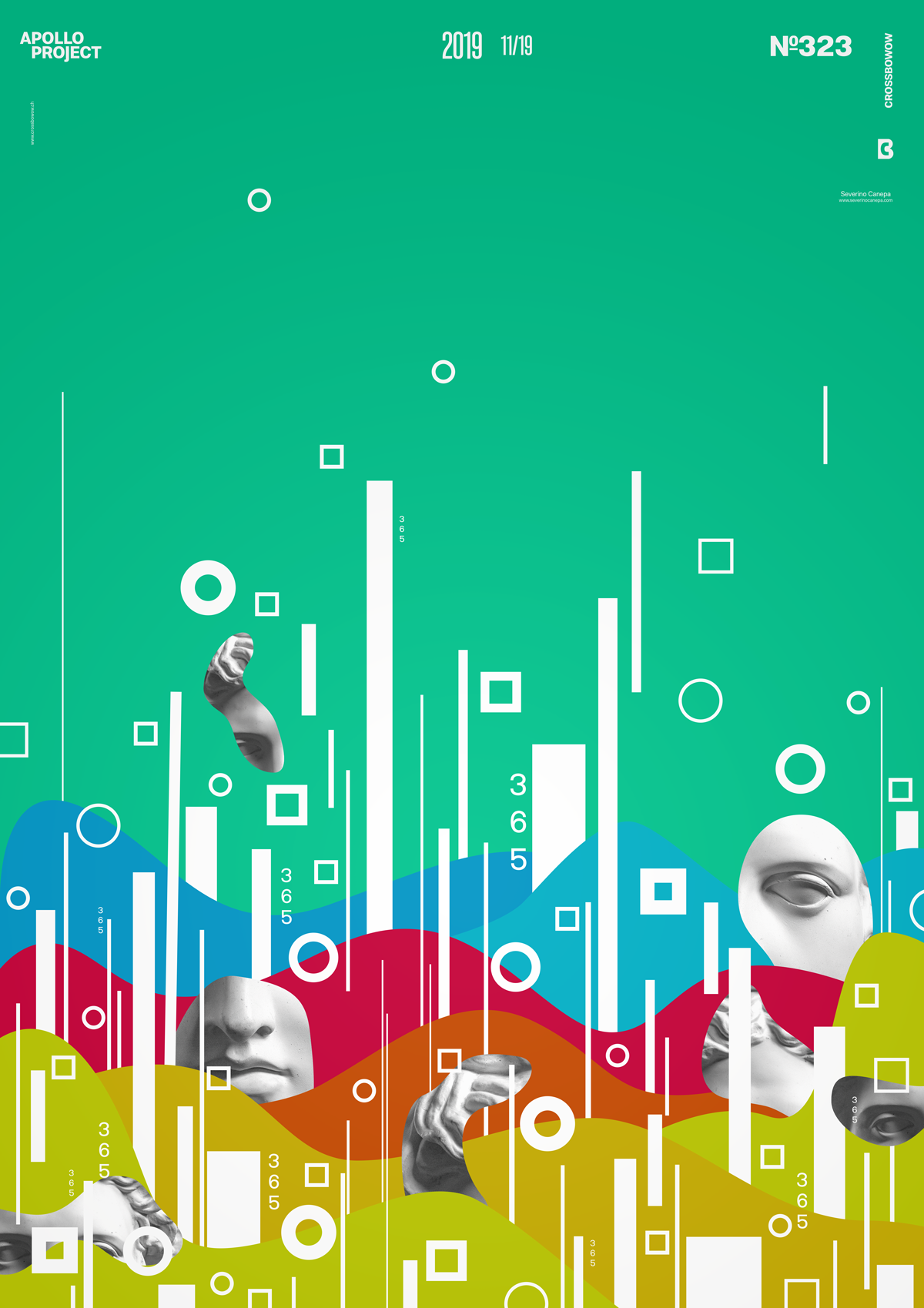
You know that I try to make the posters as quickly as I can these days because I am busy. This doesn’t allow me to ask myself the right questions. So, I only noticed that the bottom of the poster was too busy and the top too calm. I should make the element look like a shade of their number from the bottom to the top.
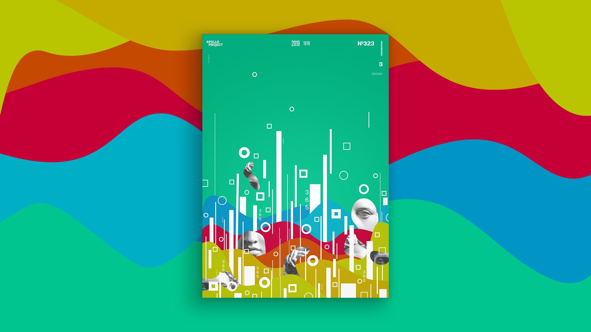
Globally, the poster looks good and interesting. The focus is directly on the bottom, which is made of many basic geometric shapes reflected by each other.
Speed Art Poster #323
I think it starts to be unnecessary. Specifically, you can look at the speed art video tutorial to see how I designed today’s poster.
Come back tomorrow to take a look at poster #324. Have a nice day!

