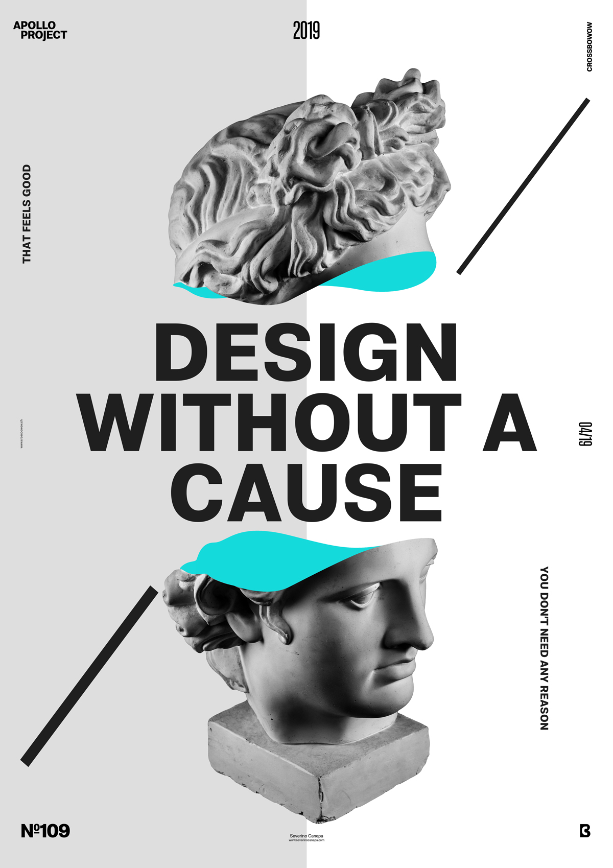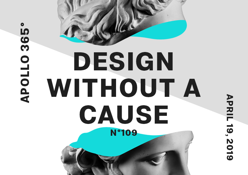
Poster #109 is a minimalist design in aqua blue, dark grey, light grey, and white.
The design
To realize poster #109, I used a short sentence inspired by an old movie title that I changed to “Design Without a Cause.” These words perfectly reflect the Apollo 365° Challenge and helped me to use letters.

I started by opening two files with two different angles of Apollo’s Statue and playing with the channels option, except it was inconclusive. I also made something similar several times, but not long ago. So, I decided to remove the pictures I generated earlier and add a new one that I cut in two parts from the middle and separated them. I added an “inside” form into Apollo’s head (aqua blue) and added the letters in between Apollo. I also add a light grey separation in the center of the poster, two rectangles, and two short sentences. One says, “That Feels Good,” and the second, “You Don’t Need Any Reason.”
Speed Art Poster #109
I hope this poster inspires you or gives you some project ideas. Please look at the Speed Art Video to discover my creative process. See you tomorrow for poster #110!

