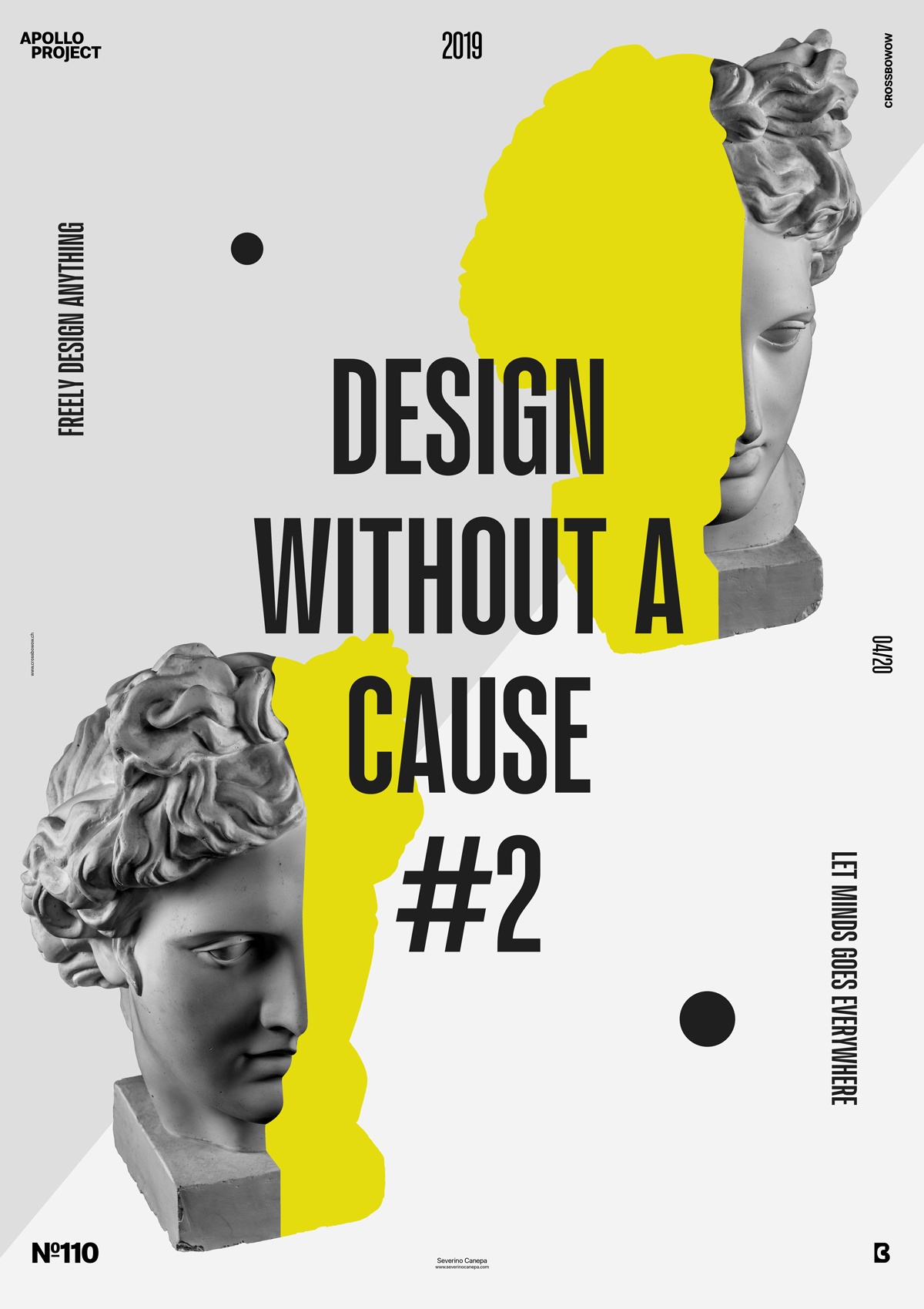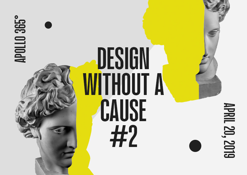
The poster #110 is the second design of a minimalist series made for the creative challenge Apollo 365°.
The design
For the first time in the Apollo Project, I created a mini-series of posters because I liked how I did the first poster, “Design Without a Cause.”

As previously stated, the poster is minimalist and shows a few elements in its composition, as was yesterday’s poster. But this time, the “inside Apollo’s form” is made of yellow, and Apollo is separated horizontally. The font was also changed to a compressed version.
Speed Art Poster #110
I hope you will enjoy watching me work on this poster. It didn’t take me long to realize this one because I already know what it will look like. That’s the utility of using a “pre-made” layout; things go faster. Thanks for coming here and following the project! See you tomorrow for poster #111.

