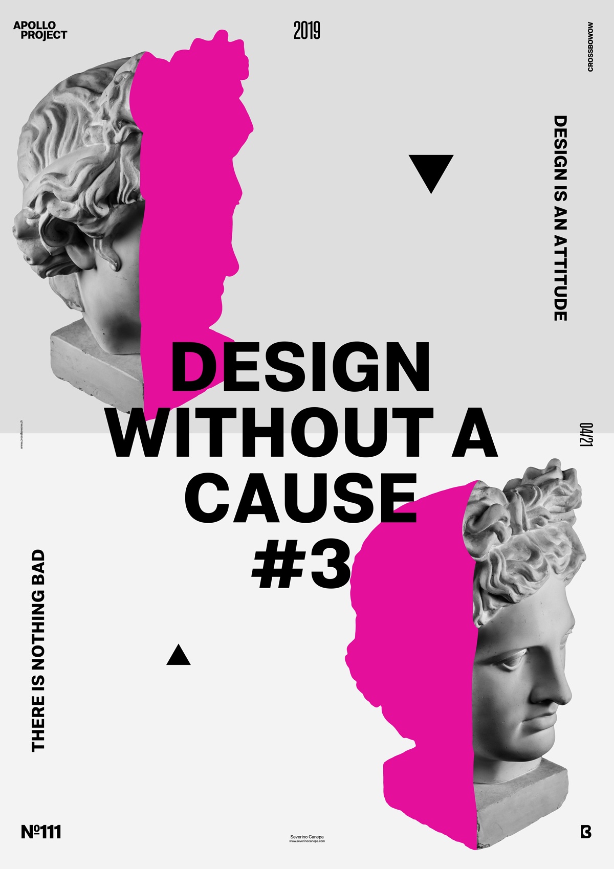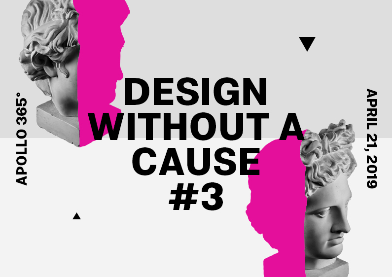
The poster #111 is the third design of a minimalist mini-series made for the creative challenge Apollo 365°.
The design

I made a few changes to this poster layout compared to the two precedents. I placed the light grey background horizontally, replaced geometric forms with triangles, and used pink colors to hide a part of Apollo’s head. Yes, it is a minimal poster design mini-series with a minimalist concept.
Speed Art Poster #111
You can watch me working on poster #111 with the speed art video on the right. You have to pay attention because I accelerate the video, which is a bit fast.
Thank you for coming to check. If you are interested in what poster #112 will look like, remember to come back tomorrow!

