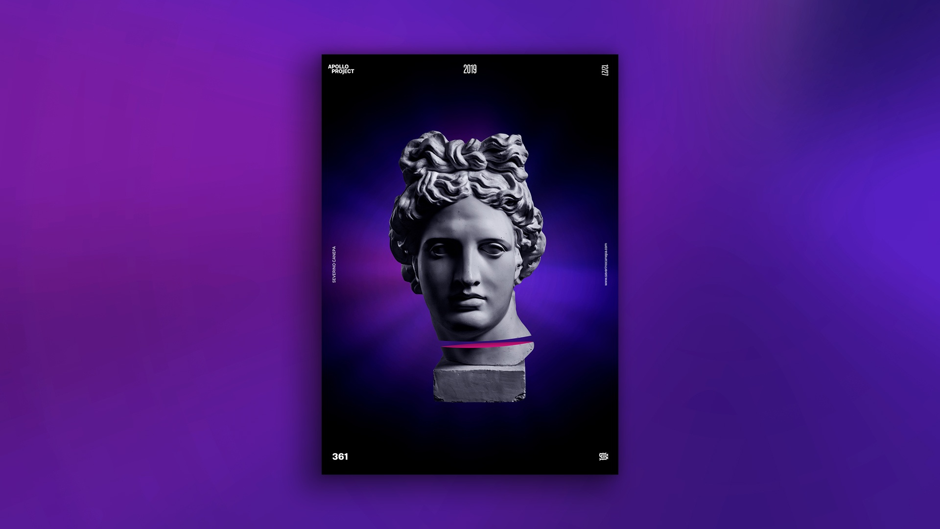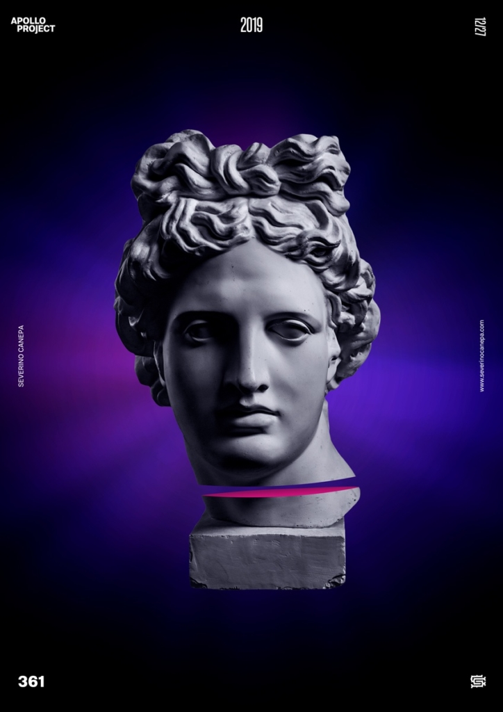
This is another minimalist poster design. Today, I didn’t get much time to create poster #361 because I had to care for the family more than usual. This is why the design looks minimalistic.
The Design

Usually, I try to design the poster earlier in the morning. Today, it wasn’t possible. So, I started creating the poster late in the morning and finished it at noon. The problem is that uploading a video on YouTube takes a long time. This is due to a slow internet connection. It is terrible, and sometimes not so much. Please don’t ask me why because I can’t answer that question.
You will notice in the video that I tried some background styles and different effects until I found the right combination of layers and settings. Sometimes, it is a game of place between them. I also used noisy gradient colors. The effect brings all these lines you almost cannot see behind Apollo.
Speed Art Poster #361
I created a speed art video tutorial for each poster daily during 2019. So, look and see if you can find something interesting or inspiring!
Come back tomorrow to take a look at poster #362. Have a nice day!

