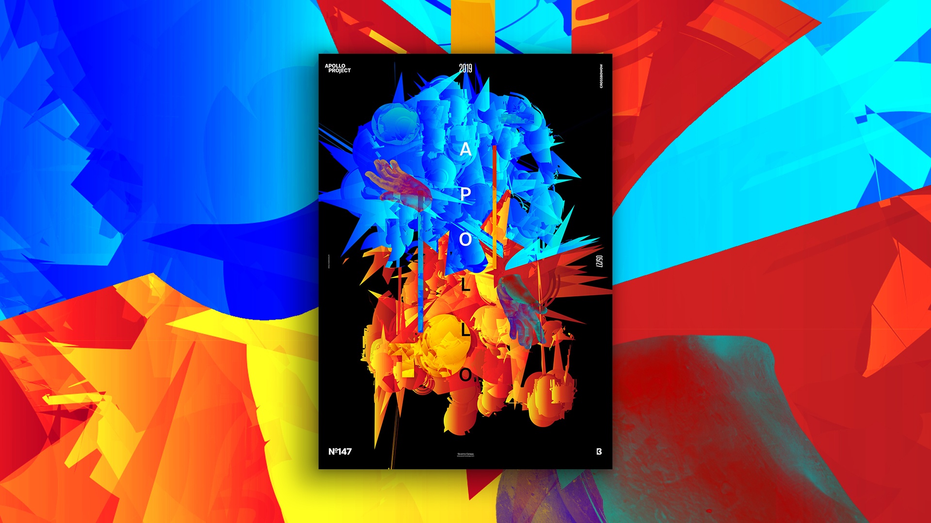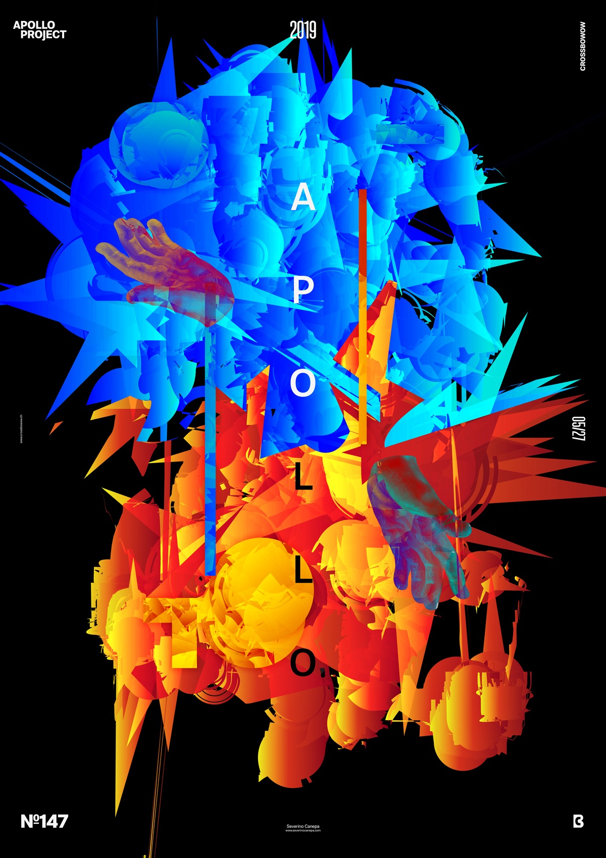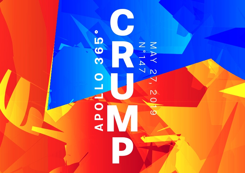
Poster number 147 is a weird geometry realized with a vector with Illustrator and polished with Photoshop.
The design
As previously stated, I open Illustrator to paint some lines with a watercolor brush that I modify with the Twirl, Pucker, Bloat, Scallop, and Crystallize tools. These tools help me generate unique shapes at different places of my strokes, making the visual more interesting.

After I had finished modifying the strokes in Adobe Illustrator, I opened Photoshop to decant the Illustrator shapes into Photoshop. The tools I use in Illustrator generate long, sharp shapes, which result in a small form in Photoshop. I extended the form and cut it to have a lighter shape. I added blend modes and filters above the shapes, such as High Pass. I duplicated the red and yellow gradient to apply a Hue/Saturation blending mode above to modify its color in blue.
Then, I applied an opacity mask to mask some part of the red shape and let the blue shape appear under it. I played with that for a moment until I found the correct visual.
Speed Art Poster #146
Hello!
If you like this vector poster art, watch the speed art video to learn the tools I used to create this result!
See you tomorrow for the poster #148!

