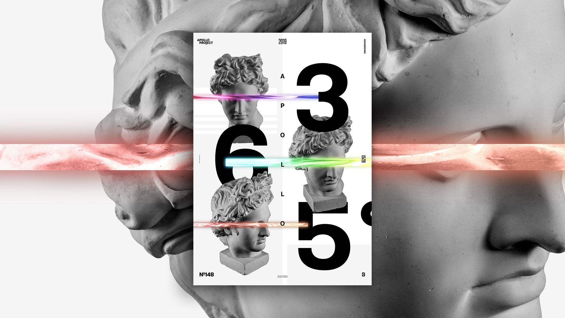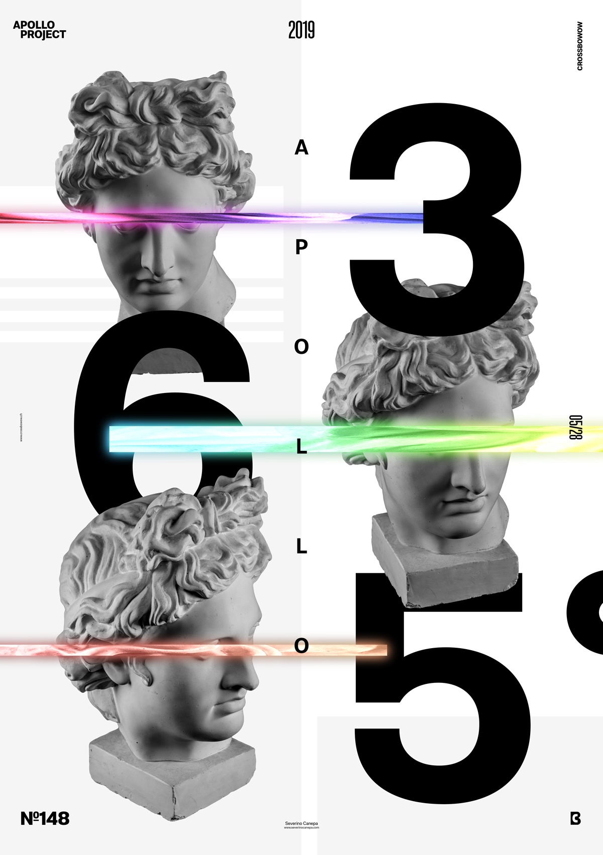
Poster 148 is minimalistic, with some touches of color. I created it only using Photoshop, which took around 20 minutes to design.
The design
There was a moment when I wanted to use large numbers on a poster. I satisfied this wish today with a Cover Poster. I placed three different Statues of Apollo and the three numbers on the opposite side to contrast the image and the vector. This effect reverberates on the side and upside down, too.

I Divided the canvas by adding a light gray rectangle, and the text placed Apollo vertically. Later, I duplicated and extended a small rectangle on each part of Apollo’s pictures. I copied the layer, added a blending mode, and duplicated the layer again to apply a Gaussian Blur Filter.
The rest of the design consists of finding the right places and sizes for each elementand making them interact.
Speed Art Poster #148
Good morning everyone!
If you are interested in today’s design, watch the speed art video I made while working on it.
I’ll see you tomorrow for poster design #149!

