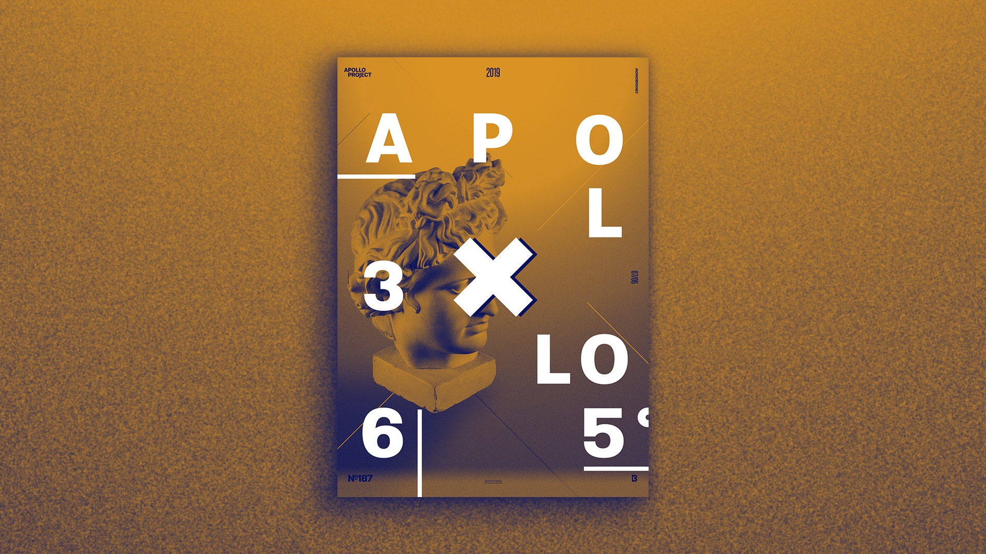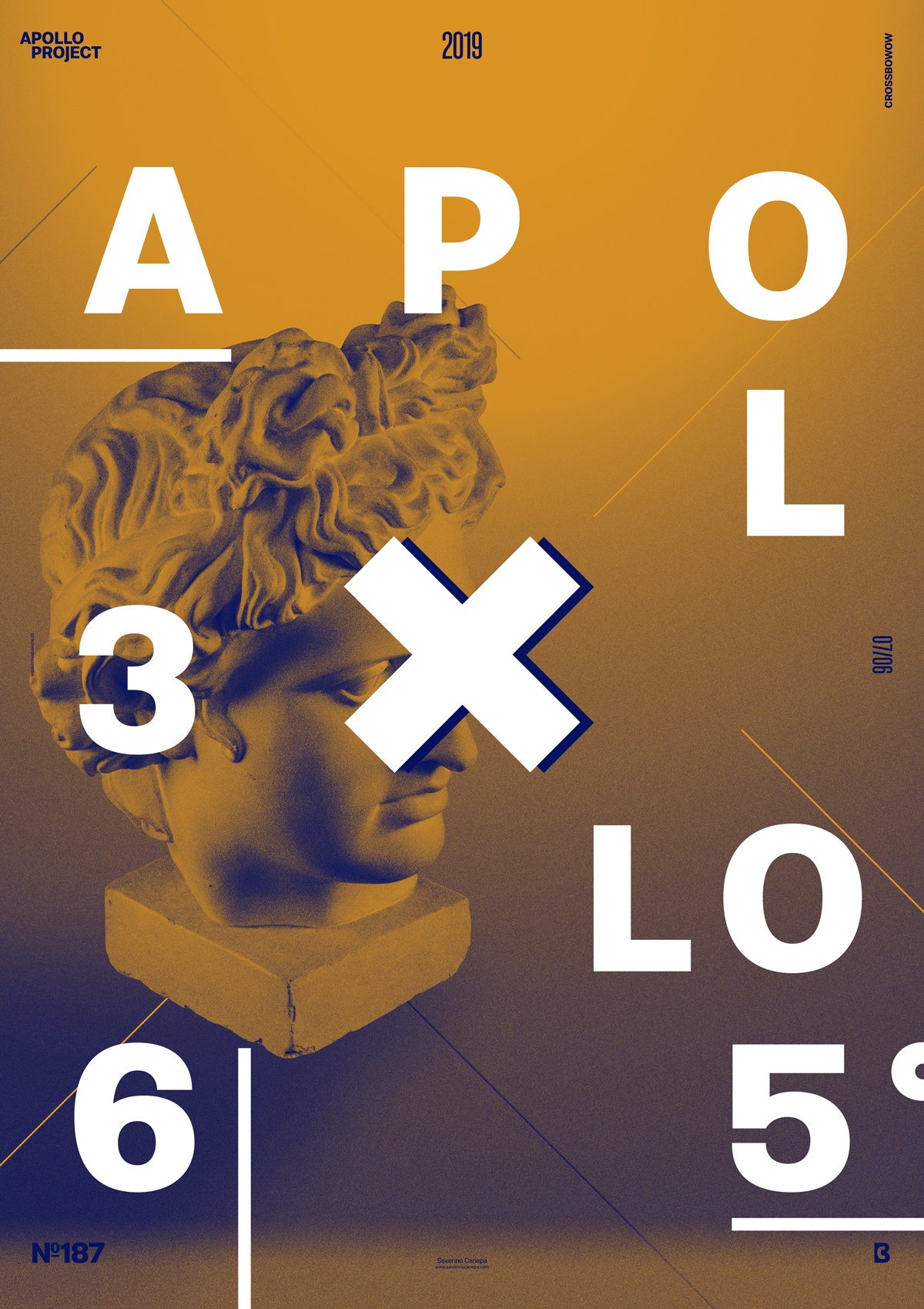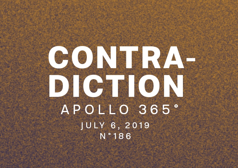
Today’s poster design is a Duotone creation created with Photoshop. I used only blue and orange.
The Design

This morning, I woke up, and it was like intuition: I wanted to design a poster with only two colors. As you will notice, I tried several color combinations to find the good one. I changed with pink, green, and others but finally decided to stick with my first idea of using blue and orange. I noticed that one of your colors should be lighter or darker than the other if you want a high-contrast image.
After finding the color combination, I created a shadow for Apollo’s statue and added large, bold typography in white as a contrast—something you can see on many posters. I knew it wasn’t that original, but I wanted to create something with two colors—remember!
Speed Art Poster #187
Like any other poster design I have made until now, I created a Speed Art Video where you can watch me working. You should look at it if you want to know my process or the steps I took to create today’s poster.
I will see you tomorrow for the poster number 188! Have a nice day!

