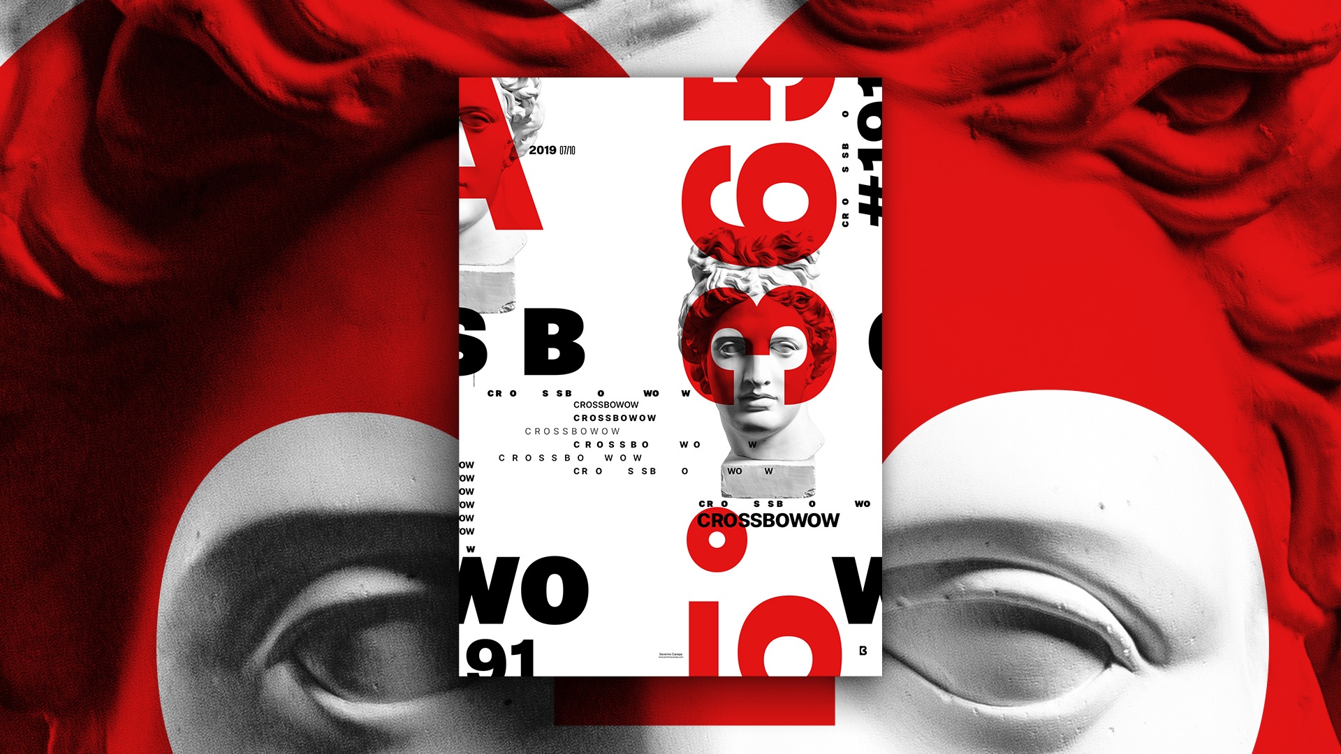
Freshly made typographic poster design inspired by Russian Constructivism but in a modern style.
The Design
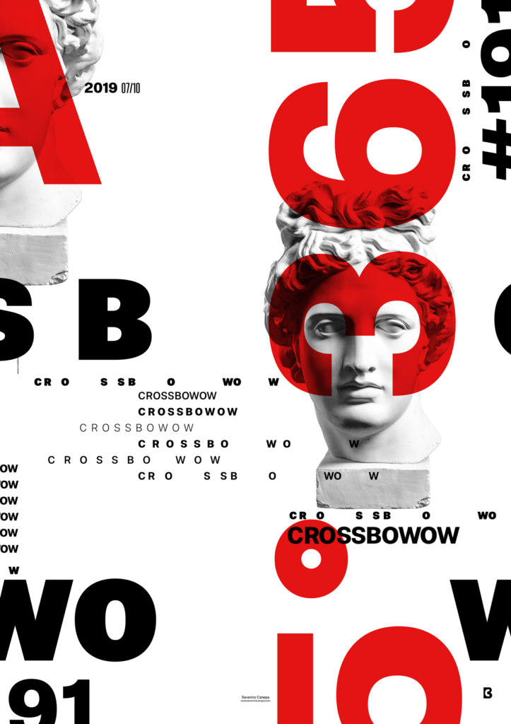
Red is the only color I used to create the “Constructivist” poster. It has a strong impact. In addition to the black—and—white—greyscale—the highest contrast you can make. I set the red with Multiply Blend Mode, which is why he looks transparent.
As a Swiss graphic designer, typography is a basis, and I love fonts, so I must create a poster with Swiss style! Effects are cool and trendy instead of typography, which doesn’t lie. They don’t blow smoke in the eyes or distract your attention ingeniously from other uncontrolled elements.
Speed Art Poster #191
Poster number 200 is coming soon! For now, you can look at the speed art poster number 191. Take as much inspiration as you can from it!
See you tomorrow for poster number 192!
