Inspired by the same topic as yesterday’s poster—space—I continue to explore this subject with a poster design that finally looks like a science fiction movie poster.
The Design

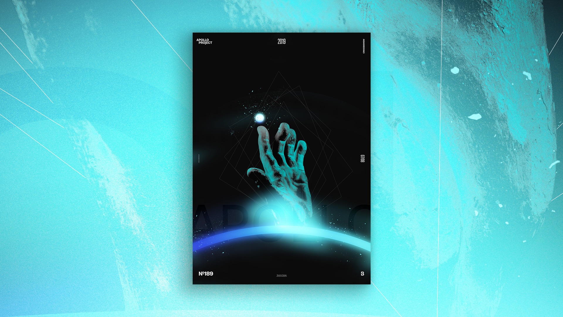
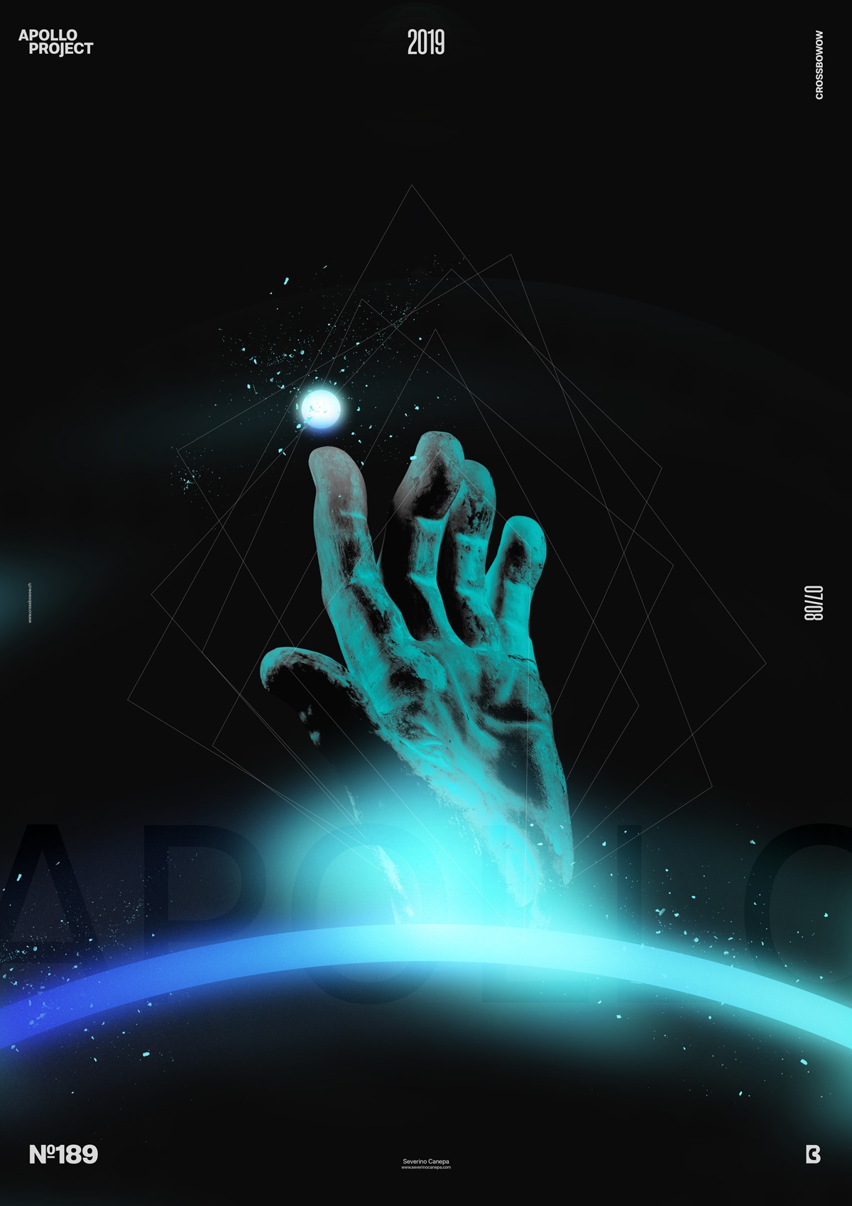
It has been a long time since I didn’t use the hand of Apollo in a poster, and I decided to fix this with poster 189. As I previously stated, I wanted a spatial atmosphere, something dark with some touch of light. I first set a dark background and created a circle with a thick stroke filled with a light blue to dark blue gradient, which helped me to suggest a planet. Secondly, I duplicated the stroke layer and added some Gaussian Blur Filter that I sed with different blend modes.
Then, I placed the hand in the center of the canvas and added an adjustment layer above to change his color. But it didn’t work because black-and-white images have no color to change. So, I went to Image, Adjustments, and Selective Color to change the greys into the blue I wanted.
I drew geometric shapes to polish the design, including a thin white stroke above the hand and a strange circle above its finger. I also added a cloud layer on the “planet’s stroke” and a light in its center.
Speed Art Poster #189
This is another spatial design that I hope you appreciate. If you were there, I think you would have liked it!
Like every day, you can look at the speed art poster to see which options I hit during creation.
Thank you again for being there, and see you for poster 190.

