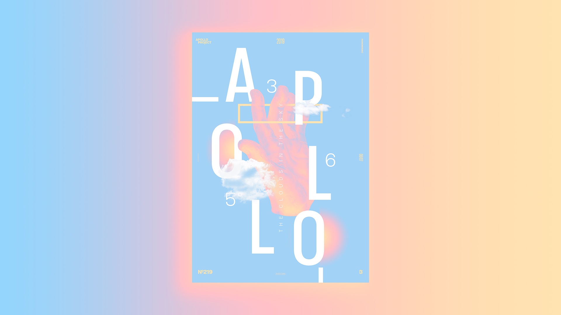
Today, I wanted to create a poster that looks light and simple. I used a picture of Apollo’s hand, clouds, typography, and geometric shapes, with a tricolor gradient and an adjustment layer set on a gradient map.
The Design
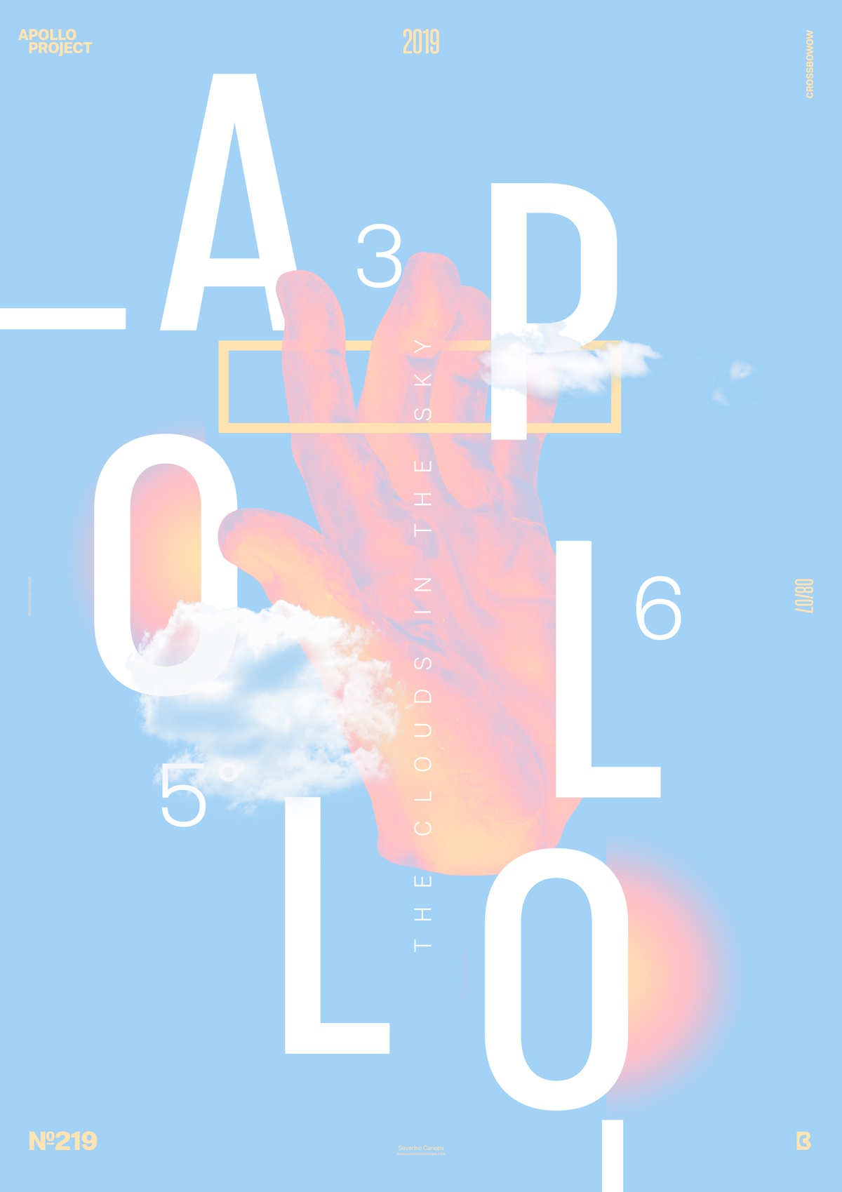
Firstly, when opening the Adjustment Layer under Photoshop and selecting Gradient Map to generate a duotone poster, I asked myself why not put three colors. Nothing crazy, I know that! It’s what I did. I used three colors, and I didn’t have to play so much with the adjustment because it looked like it was.
Above the adjustment layer, I added my font because I wanted it white. If I have placed the layer down the adjustment layer, it will affect the color of the font, and as I said, I didn’t want it. Then, I started to arrange my letters one by one on the canvas. But I knew something was missing. After a moment of reflection — because of the blue background — I remembered clipping some clouds. I integrated them around the and of Apollo and above the font.
To finish the design, I placed some thick lines near the start and end of the title and a yellow rectangle that passes between Apollo’s fingers.
Speed Art Poster #216
I still feel the jetlag relatively strongly. It is getting better every day, but it is still there.
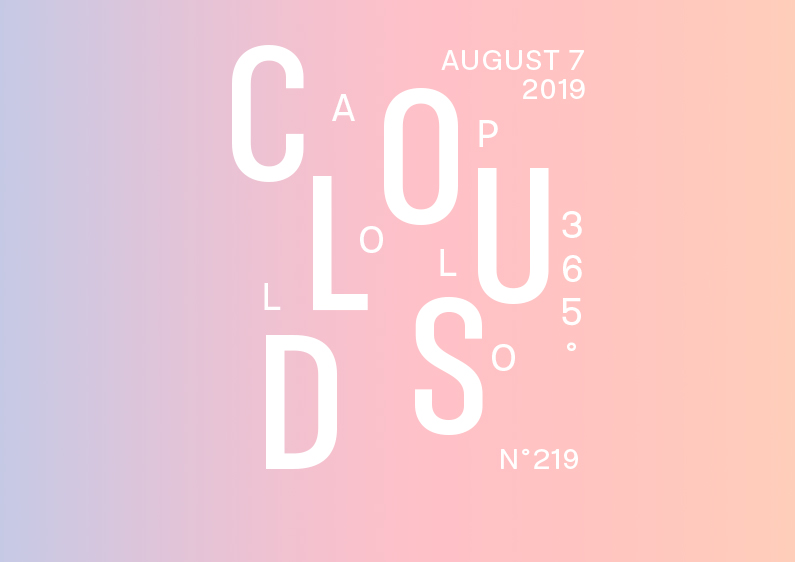
Look at the speed art video 219 to learn how I realized the “Clouds” poster.
Have a nice day, and see you tomorrow for poster 220!