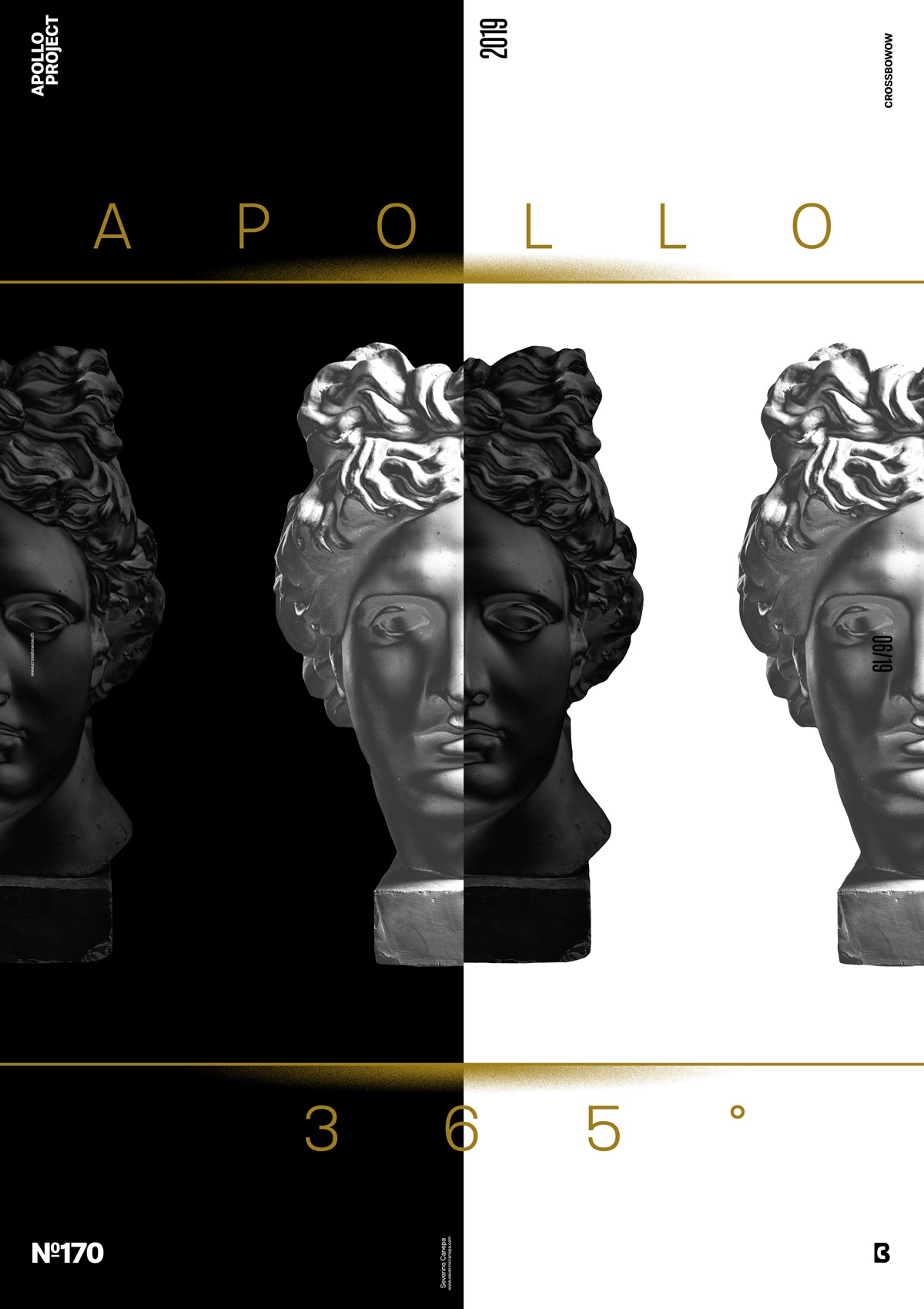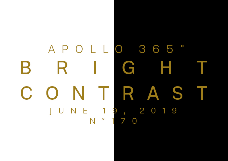
Elegant, minimalist, sophisticated, a bit mystic, and chic are the keywords to describe the Bright Contrast Poster and its design.
The design

Firstly, I wanted to find a brand new, fresh look for Apollo, like a total make-up on its face. I applied a new Adjustment Layer, Curves, to play with the options and see what I could develop. It results in a metallic effect. I liked it and decided to create a black version of it. So, I applied another Adjustment Layer, Curves, on a copy of Apollo’s statue and found a way to make it black. It was the most challenging part of creating this poster.
Secondly, I divided the canvas by the middle with a black-and-white area. I also changed the direction of some layout types to fit these colors. While writing these lines, I realized that I probably should have used the gold color I made to amplify its beauty. Then, I duplicated Apollo’s Statues and placed them on the side of the canvas to finish by adding two lines and the project’s name, “Apollo 365°,” with a thin font version.
Speed Art Poster #170
It feels so good to start a new style! I am satisfied with the style of Apollo’s statue and the layout of the “Bright Contrast” Poster.
As usual, you can watch the speed art video to discover my process and how I created today’s poster! I wish you a nice day, and I look forward to seeing you tomorrow for poster #171!

