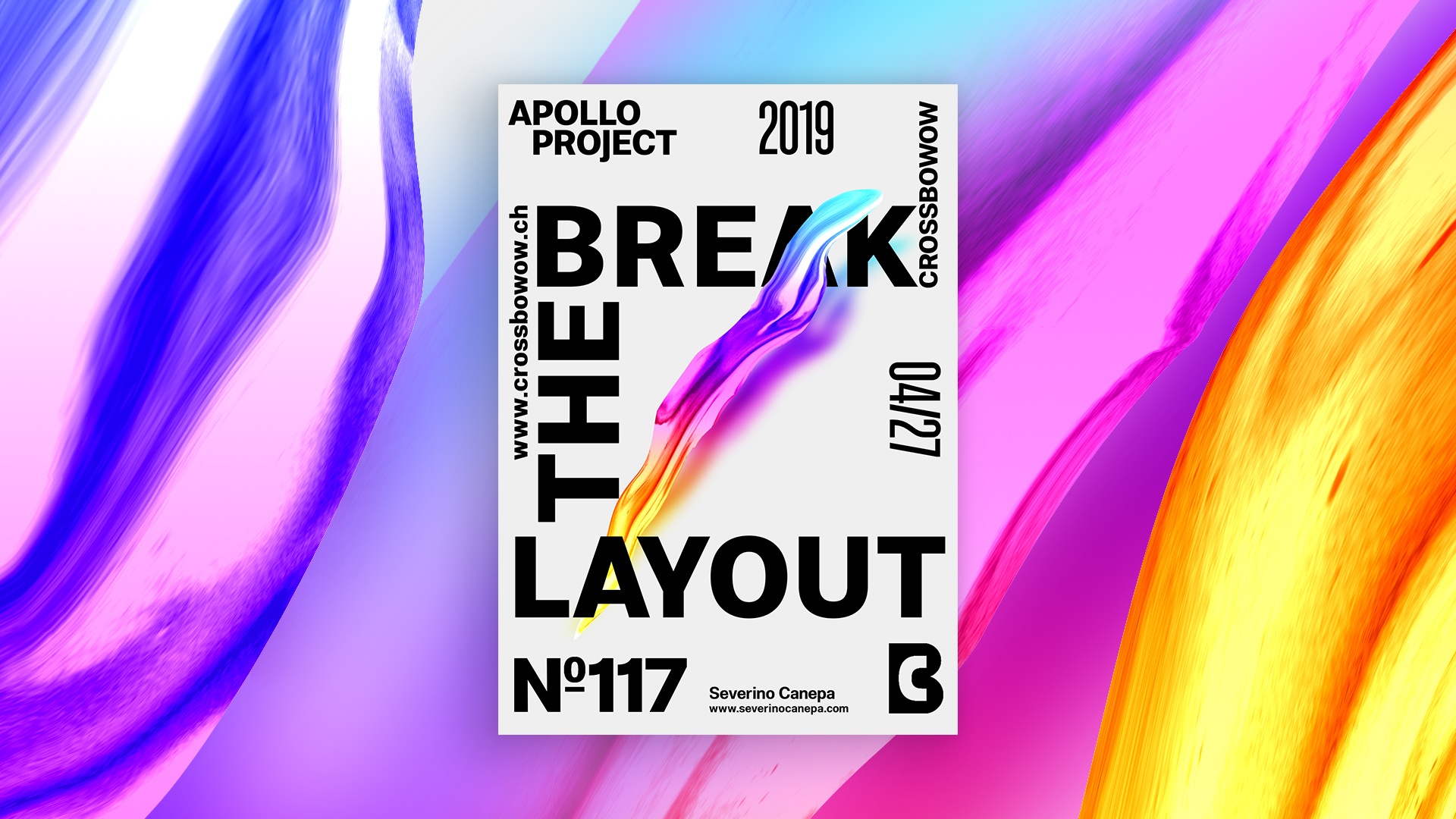
Poster #117, Break The Layout, is a typography-based, minimalist design in which, as the name says, I broke the layout by changing the font size, dramatically increasing its weight and boldness.
The design
It came like that. I mean to change the layout to a bolder and more extensive version. It provides a fresh look to the Break The Layout poster and brings me new ideas to implement in the subsequent poster designs.
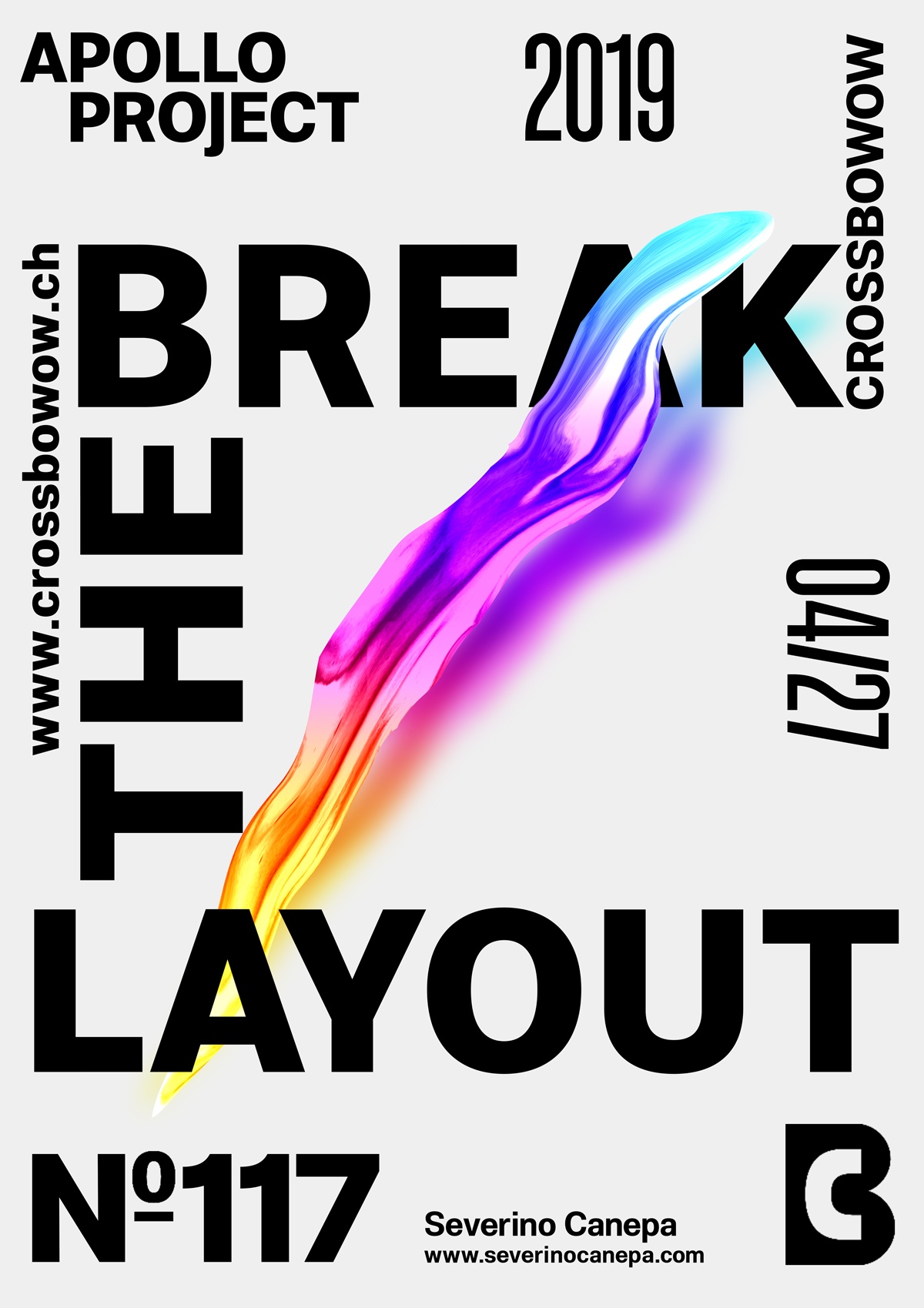
I wanted to add text and citations to play around with typography and an amicable solution hidden under my nose: use the elements and pieces of information to create a new layout.
The strange form in the center is a “Liquified” version of a part of Apollo’s picture with a gradient layer.
Speed Art Poster #117
Today, I had the time to design the whole day if I wanted it, but instead of things going fast, I quickly got happy with the design and the ideas I came up with. I spend a short time designing to get a good and bold result that I like. I hope you will enjoy watching me working on Break The Layout Poster by watching the speed art video #117.
Thank you for coming here , and see you tomorrow for poster design #118!
