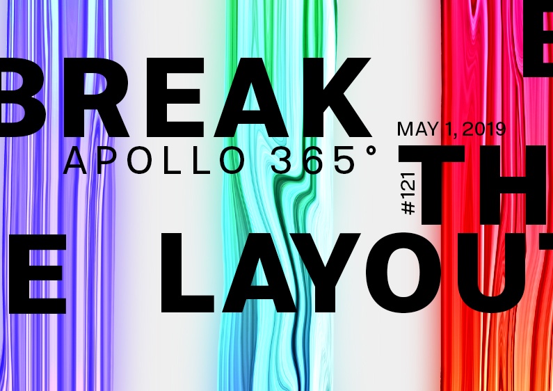

Today marks the end of the mini-series Break The Layout. Like the other poster, number 5 is typography-based and made with liquid forms from Apollo’s Statue.
The design
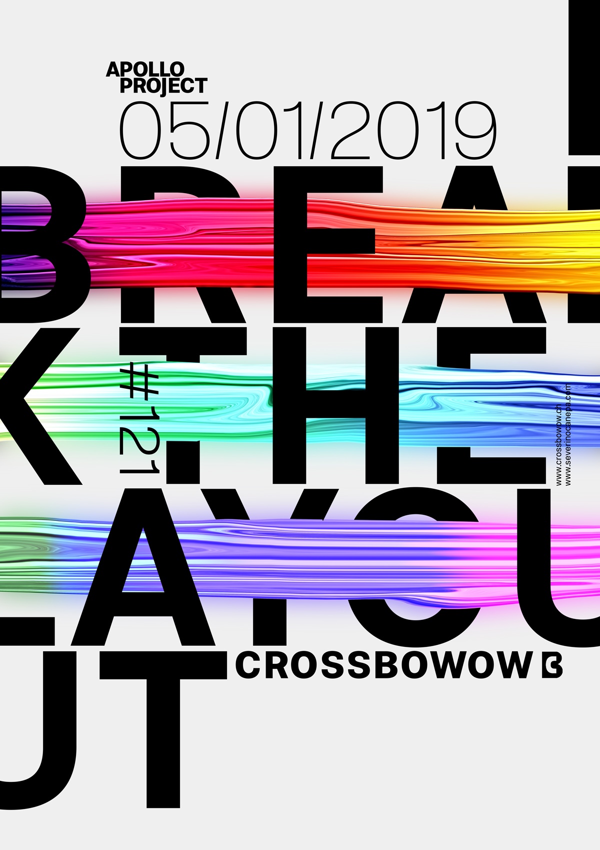
To create poster #121, I used the regular version of the typeface Molde. I changed the layout to find a new way to express creativity with the font and the weird forms I created. The poster is all about finding the right balance between typography and forms. Which should pass over the other? I asked myself this question sometimes.
Nothing is complicated there; I only use my sense of aesthetics to arrange the words and pieces of information together.
Speed Art Poster #121
Here we are again for the Speed Art Video #121! If you have a question about how I did this or that, you should watch the video first! If that doesn’t answer your questions, please ask me anything!
See you tomorrow for poster design #122!