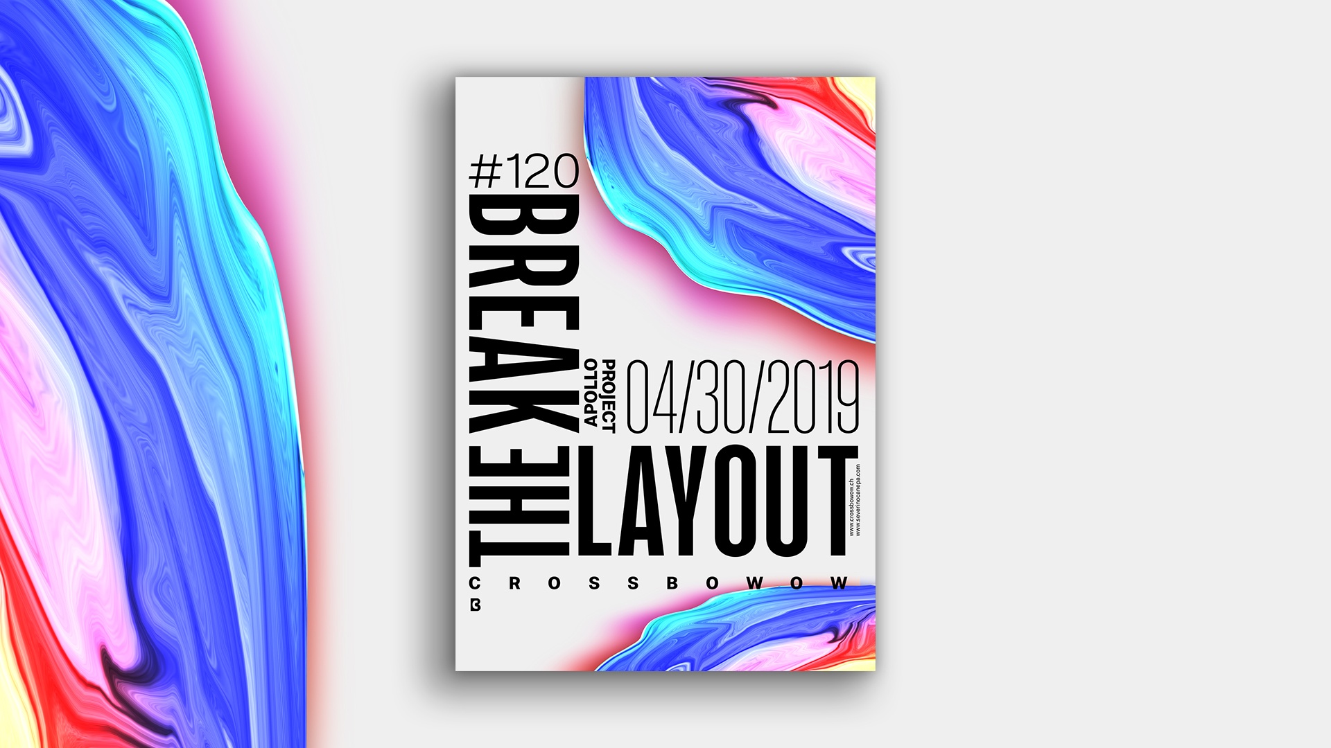
I continued the mini-series poster “Break The Layout,” but I broke the layout that time to create something new and original.
The design
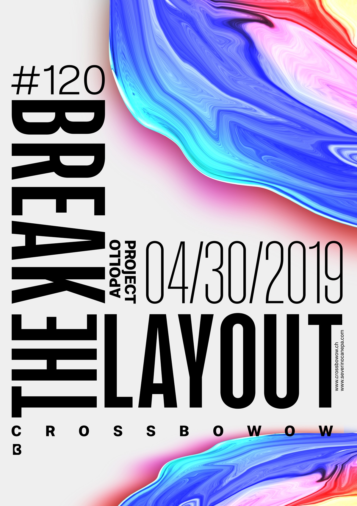
I change everything about the mini-series to create something new and fresh about the layout, from the font variations to the pieces of information I arrange differently to support and fit the title. Finally, the only thing I keep from the older posters is the “Liquified” Apollo picture—the weird and colorful forms.
Speed Art Poster #120
More and more people are watching and commenting on my work on my YouTube and other social media channels. Big thanks to those who follow, ask questions, and say hello!
Have a nice day, and see you tomorrow for poster #121.
