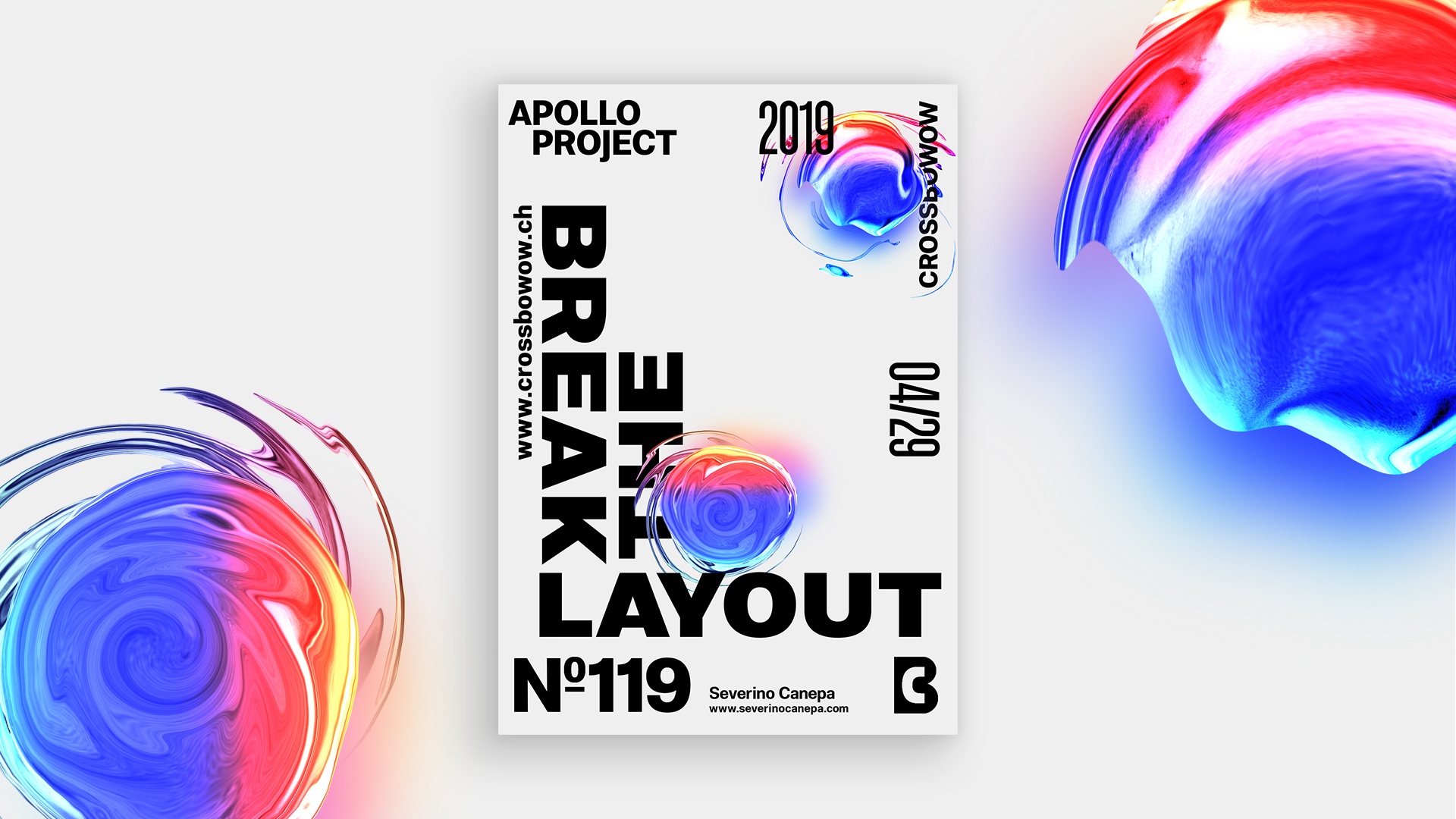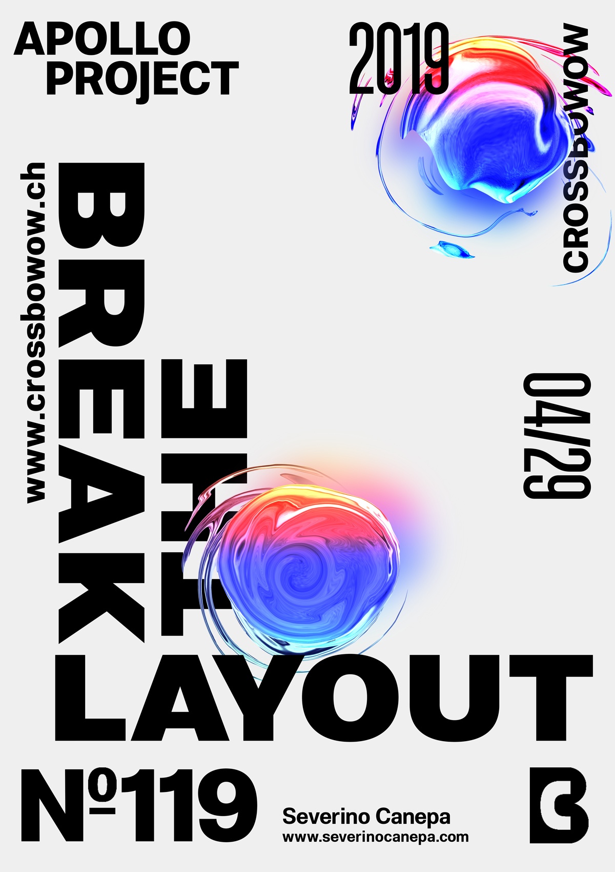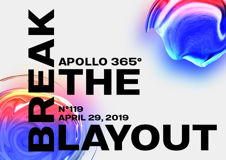
As usual, poster #119 Break The Layout #3 is a typography-based and minimalist design where I keep the same layout as the two first posters of this mini-series.
The design

Looking at the first two posters, you will recognize that the colorful, weird shapes are relatively the same, and the pieces of information around the corners are the same: the typography and its arrangement change. I used an extended version of the type to generate a new feel about the poster design.
Speed Art Poster #119
The speed art video for this poster is available, and I hope you enjoy watching me work on it!
Have a nice day, and come back tomorrow for poster #120!

