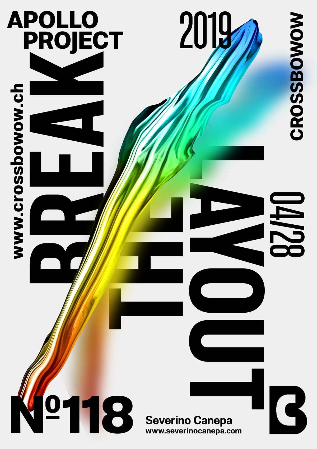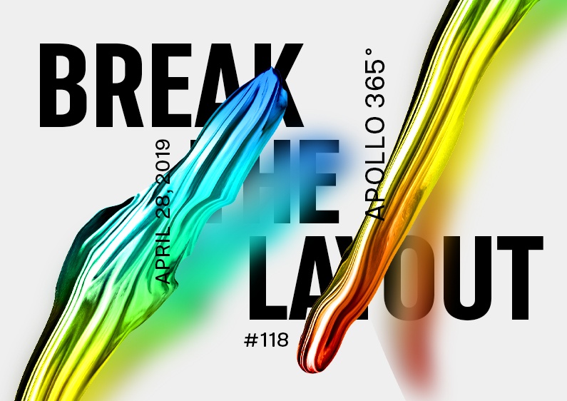
Poster #118 Break The Layout #2 is another typography-based and minimalist design where I keep the same layout as yesterday.
The design

Poster number two, issued from the mini-series, feels the same as yesterday but looks slightly different. The layout with the elements on the corner is the same, but not the title “Break The Layout.” I used a condensed version of the typography and arranged it differently.
I like this minimalist style because of its aesthetic — mainly because it didn’t take me long to design!
Speed Art Poster #118
As usual, I had a lot of fun designing today’s poster #118, and I hope you will notice it if you watch the speed art video I made for this occasion.
Have a nice day, and see you for the next poster, #119!
Music Credits
The song is “Feather Duster,” created by a geographer.

