Sunday! Today is Sunday, and my mind is going everywhere for a project we are making for a customer who wants to see everything before making a choice. If we defined many things before, he sneakily returns on each step we approve to add or remove things according to his new vision. We defined the brand earlier, but there was nothing to do; he changed everything. That said, it was a nice day, don’t worry!
The Design

Yesterday’s poster inspired me. I was working on a minimalist poster with a symmetrical ax in the middle of the canvas.
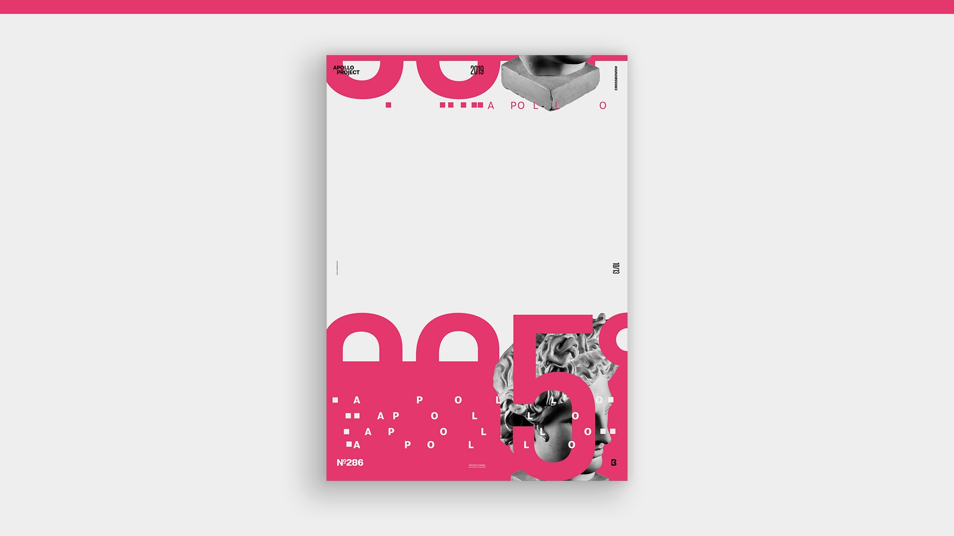
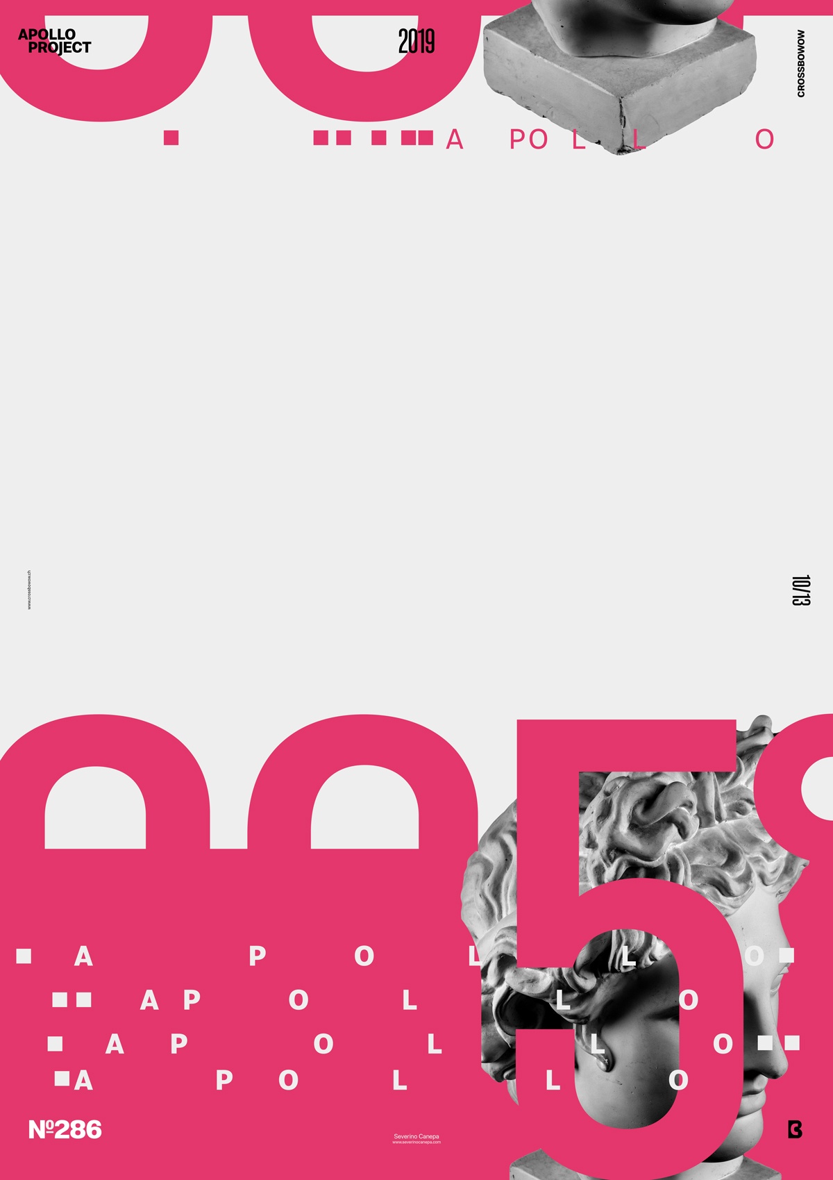
Today, I experimented with something similar, but I separated the poster from the center horizontally, with a smaller area on the top and a larger area on the bottom. The font sizes and the picture of Apollo are the same on the top and the bottom.
I create an asymmetrical ax above the center of the canvas and leave ample “white space” in between. It is a repetition where I play with the size’s contrast of elements only by showing less or more in different areas. I guide the viewer’s eyes from the top to the bottom because the symmetry is horizontal, as well as the elements, except that the eyes are attracted by a horizontal movement (from top to bottom). Once the eyes focus on the more minor elements at the bottom, he wants to notice if they are the same on the top. And they are, except that the bottom shows the top of Apollo, and the top is its bottom. Ok, it may be only my theory. I should dig deeper to create and experiment more with that stuff.
Speed Art Poster #286
I am still using the Capto app to register my screen, and I was afraid because when I upgraded my Mac to OS Catalyna, I could not register anymore. Fortunately, I only had to allow Capto to use some security files to work correctly!
As I mentioned yesterday, you can watch Speed Art video tutorial #286 to learn how I created the Bottom-Top poster. It’s nothing magical, don’t worry.
I’ll see you tomorrow to discover poster #287! Have a nice day!

