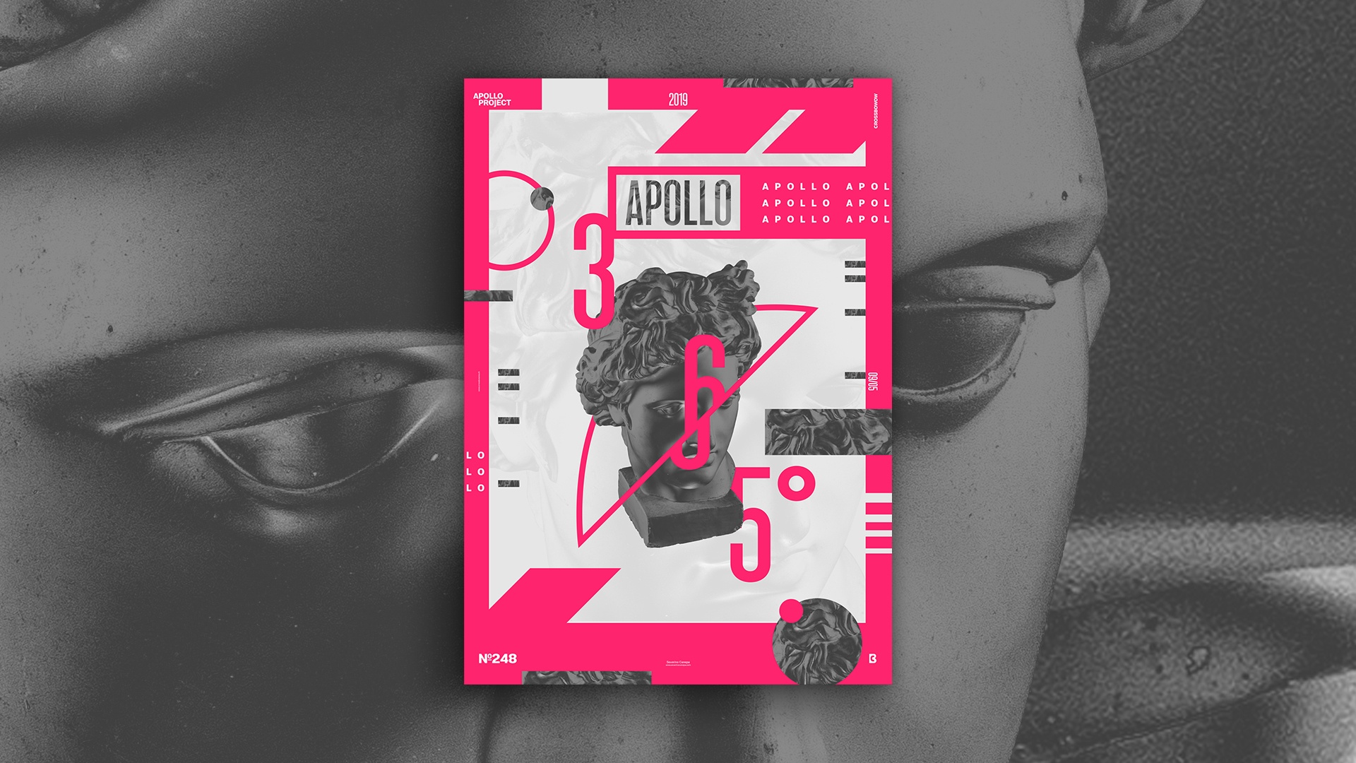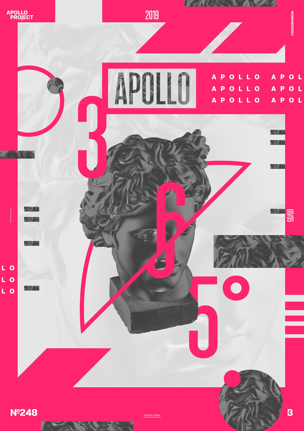
Today, I avenged yesterday’s poster about quality and style. The creation still deserves more work, but the visuals are nice and fresh.
The Design

I wanted to change the monotony of a grey Apollo by using something new to my eyes. That’s why you can see a dark Apollo on today’s poster. It was a good idea because I felt like I was designing my poster with something new.
That was my starting point for this poster. After setting a new Adjustment Layer on Apollo, I chose a bright and vivid pink color to fit its new colors, which work well together.
The rest of the design is only about your graphic affinity. Placement, sizing, contrast, and all the usual stuff a graphic designer should care about when designing something — that is easy to say, but sometimes, not so easy!
Speed Art Poster #248
How do we call the phenomenon of wanting to go to bed earlier and finish late at night? I am sure this effect has a name.
Every day since I started the daily design challenge Apollo 365°, you can take a look at the Speed Art Video #248 to know how I made today’s poster. That is for the curious!
If not, I see you tomorrow for poster 249!
Have a nice day!

