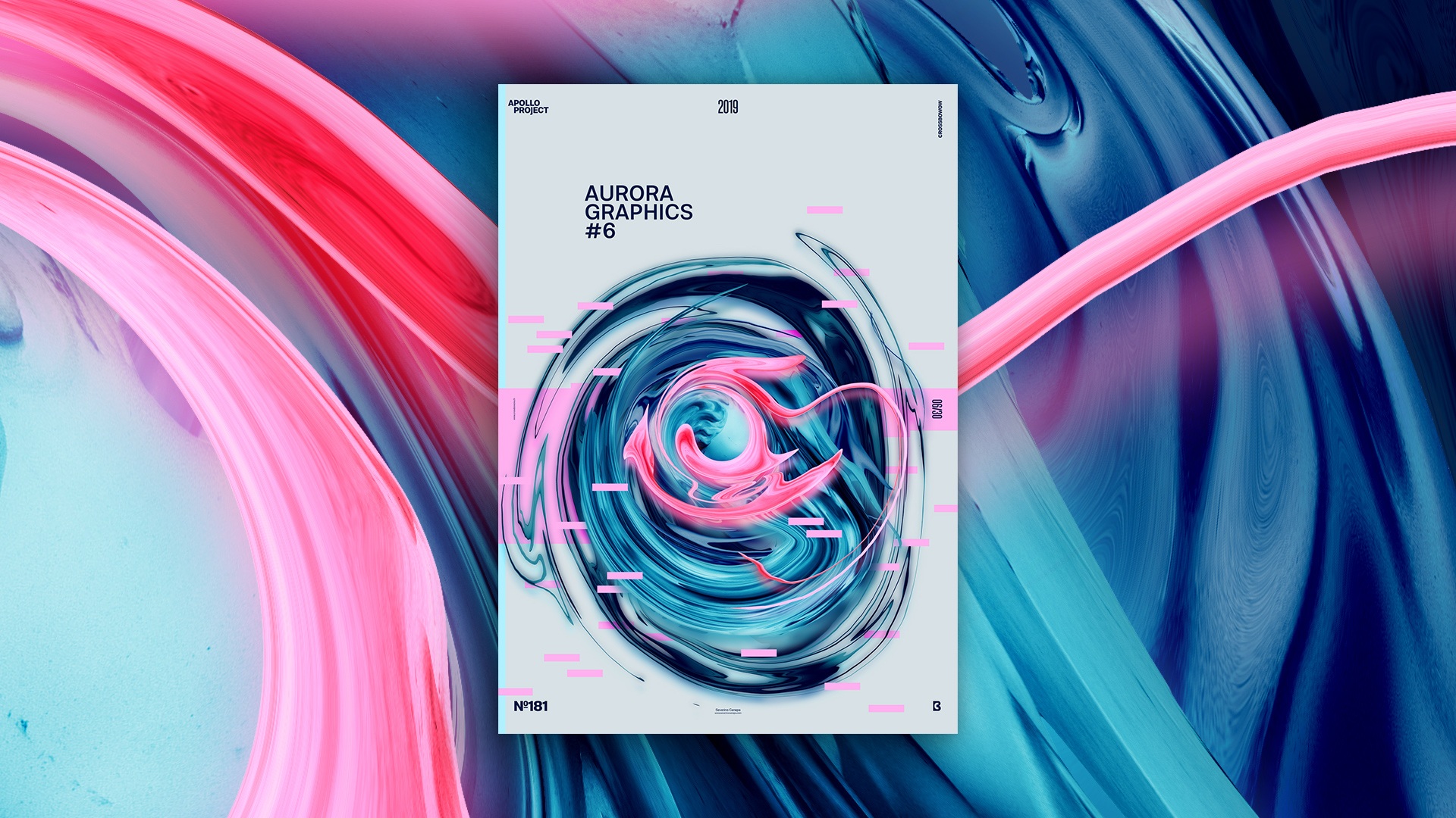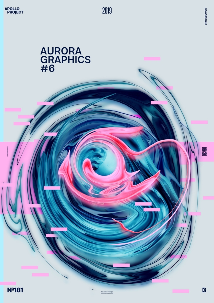
Poster creation number 6 of the mini-series named Aurora Graphic. As you notice, I used pink to create this new poster.
The Design

To add contrast, I added a pink fluid on top of the other fluid forms to generate more contrast, and it was time. Because this light pink is fresh and looks nice. I made full use of Photoshop layers to obtain this effect of fluid. After using the Filter, Fluidify, I copy and paste the layer behind and on the top of the fluid form with a Gaussian blur effect.
You must test the blending mode options to get a good result. I used two layers of Gaussian Blur: the top for the light and the bottom for the shadow. Once I created three fluid forms, I tried to find a geometric form to fill the background and make it more interesting. For example, I used a thin, light blue on the left and two pink horizontal rectangles to contrast with the blue of the fluid forms.
Then, I added several small rectangles between the fluid forms to add more depth to the canvas.
Speed Art Poster #181
On the right, you can appreciate the Speed Art Video I made today while creating the poster.
Thank you for coming here and meeting me tomorrow for poster number 182!

