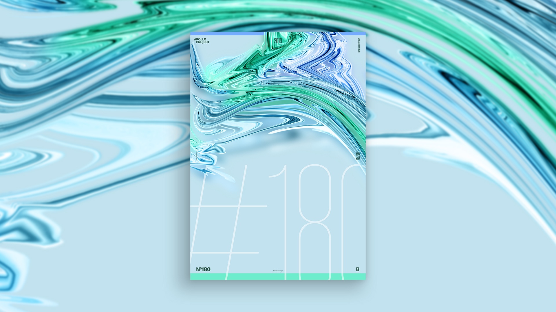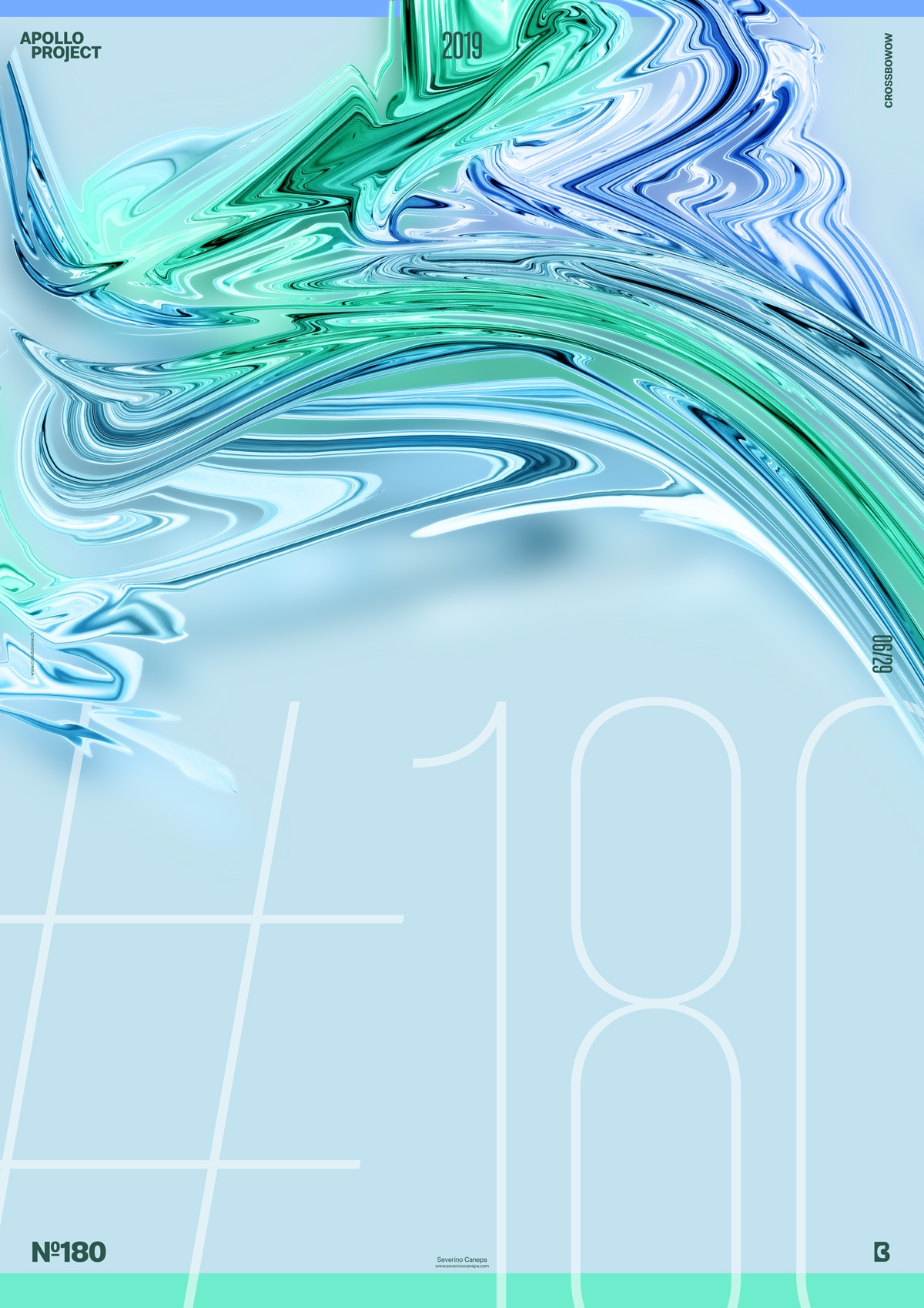
The number of posters is growing. I introduce you to poster number five of the Aurora Graphics miniseries and poster number 180 of Apollo 365°.
The Design

Another poster design was made with the same usual elements of this mini-series: fluid and geometric form, without forgetting typography. For this one, I used a large and ultra-thin version of the font Molde, which I have used since the start of the Challenge Apollo 365°.
As you can see, I went from a minimalist style to another one. Graphic designers know that minimalist creation is not easier than complex creation. Creating a minimalist design is mainly about designing by subtraction and taking care of every little detail twice as much. Okay, I was also in a hurry to finish today’s poster. I already know I will be for tomorrow’s poster, too.
Speed Art Poster #180
I am amazed by the number of posters I created, 180. What’s a significant number?
I have one more Speed Art Video for you to watch! Please review it and tell me what you think about Poster 180 on social media!

