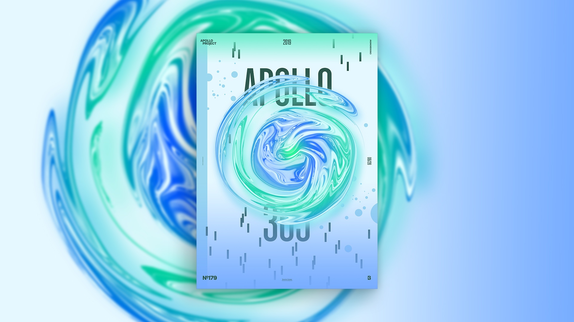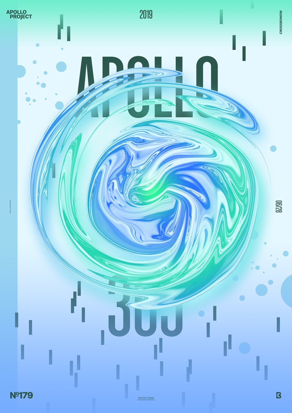
The time has come to reveal poster number four of the mini-series Aurora Graphics, which is an accurate continuation.
The Design

The process, elements, color palette, and geometric forms are the same. As usual, the layout is not the same as the mini-series designs; the idea behind the poster is different, as are my feelings and tastes. But there is still the same sensitivity about the placement.
I used gradients from color to transparent this time. It is approximately the only new thing I used.
The fluid shape in the center of the canvas set the pace of the poster. I follow it with the condensed font of the title and contrast it with the small rectangles that I scattered here and here.
Speed Art Poster #179
It was a hot day when I created this poster. I felt sweating like I was melting behind my computer all day long.
I hope you will enjoy watching me work on this poster with the Speed Art Video I made! Take a look and come back tomorrow for poster 180!

