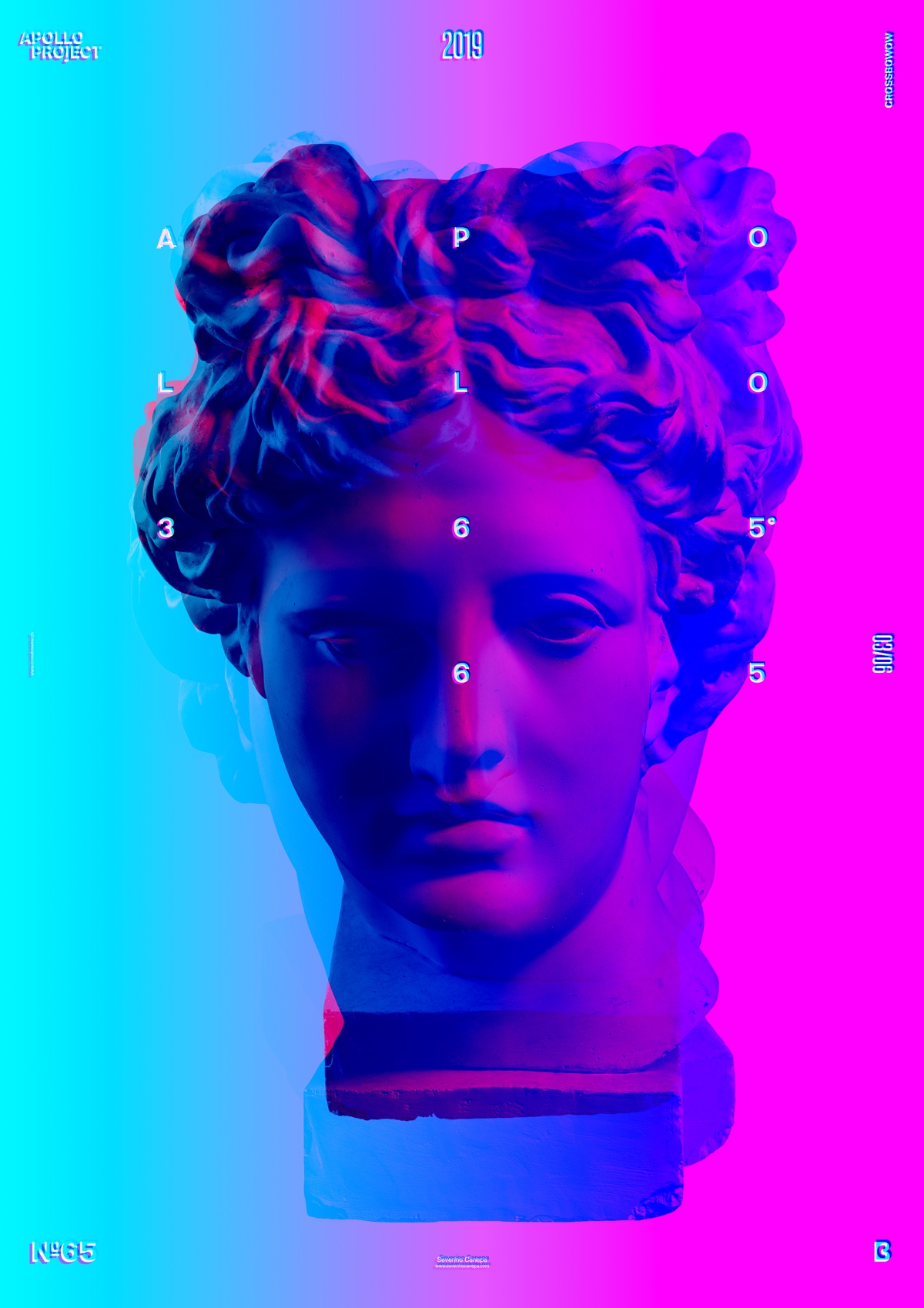
To realize today’s poster, I explored Channels’s colors in Photoshop mixed with two other pictures of Apollo’s head. I used gradients to mask or show the red, green, and blue channels to see what happens when mixed .
After being satisfied with the result, I added a typographic layout above the picture, duplicated the text two times in red and blue, and changed their blending mode to create a glitch effect.
Combining the three Apollo’s heads is intriguing because the channel’s colors appear, and different parts are hidden in each picture. I would be lying if I told you I did not know the result and what it would look like. One of the best ways of learning is by doing, exploring, and mixing options until pieces of information penetrate your brain. It will become a soft skill and a way to master your style.

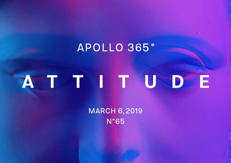
Attitude Speed Art Poster #65
Designing a poster and re-discovering Photoshop Channels was a pretty good day!
I like this minimalist design. The halftone effect creates a kind of motion between the pictures. It’s a live poster!
I want to thank the people who follow me, comment on my work, and enjoy watching my poster process.
Have a nice day! See you soon for the poster #66!

