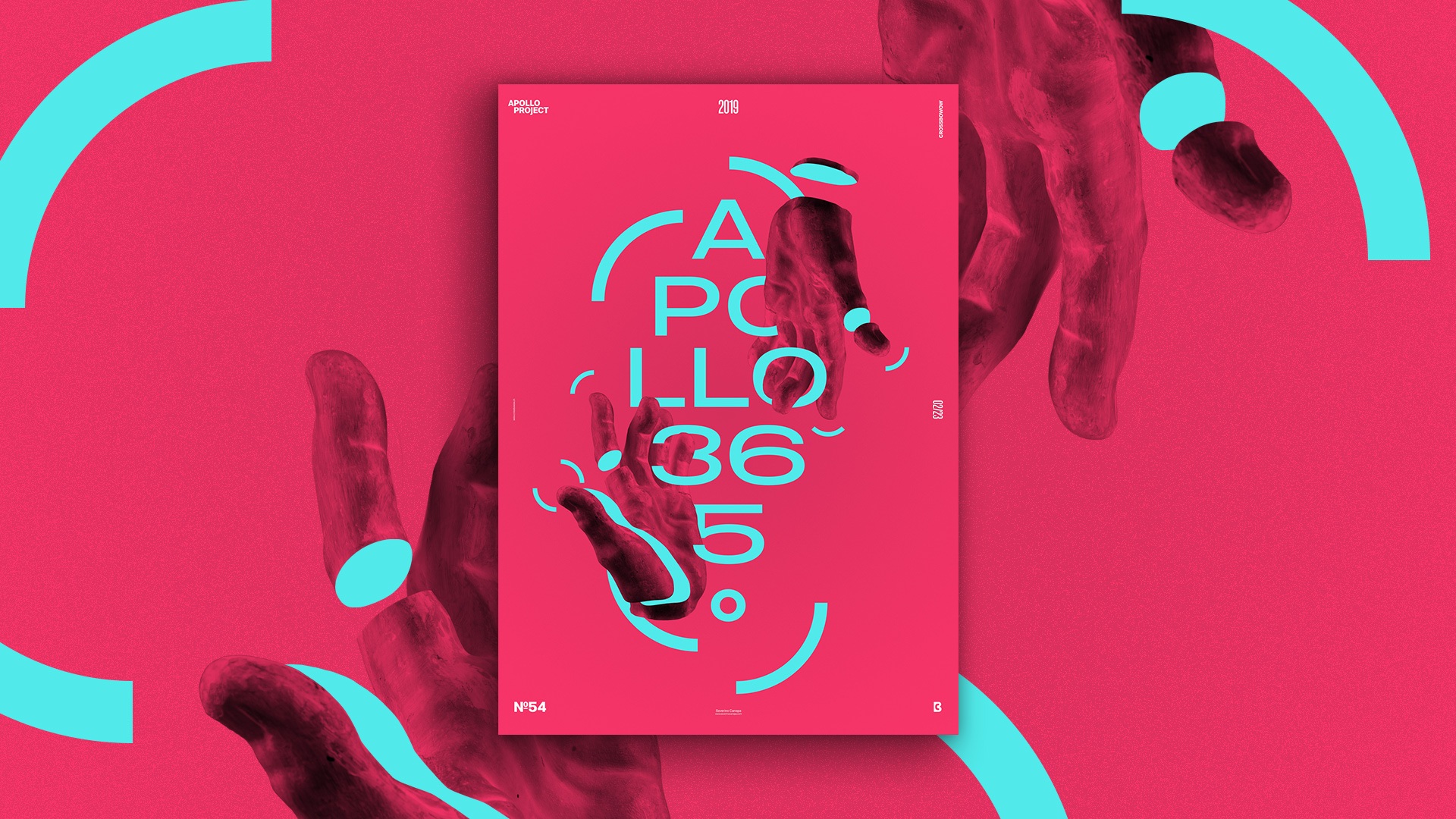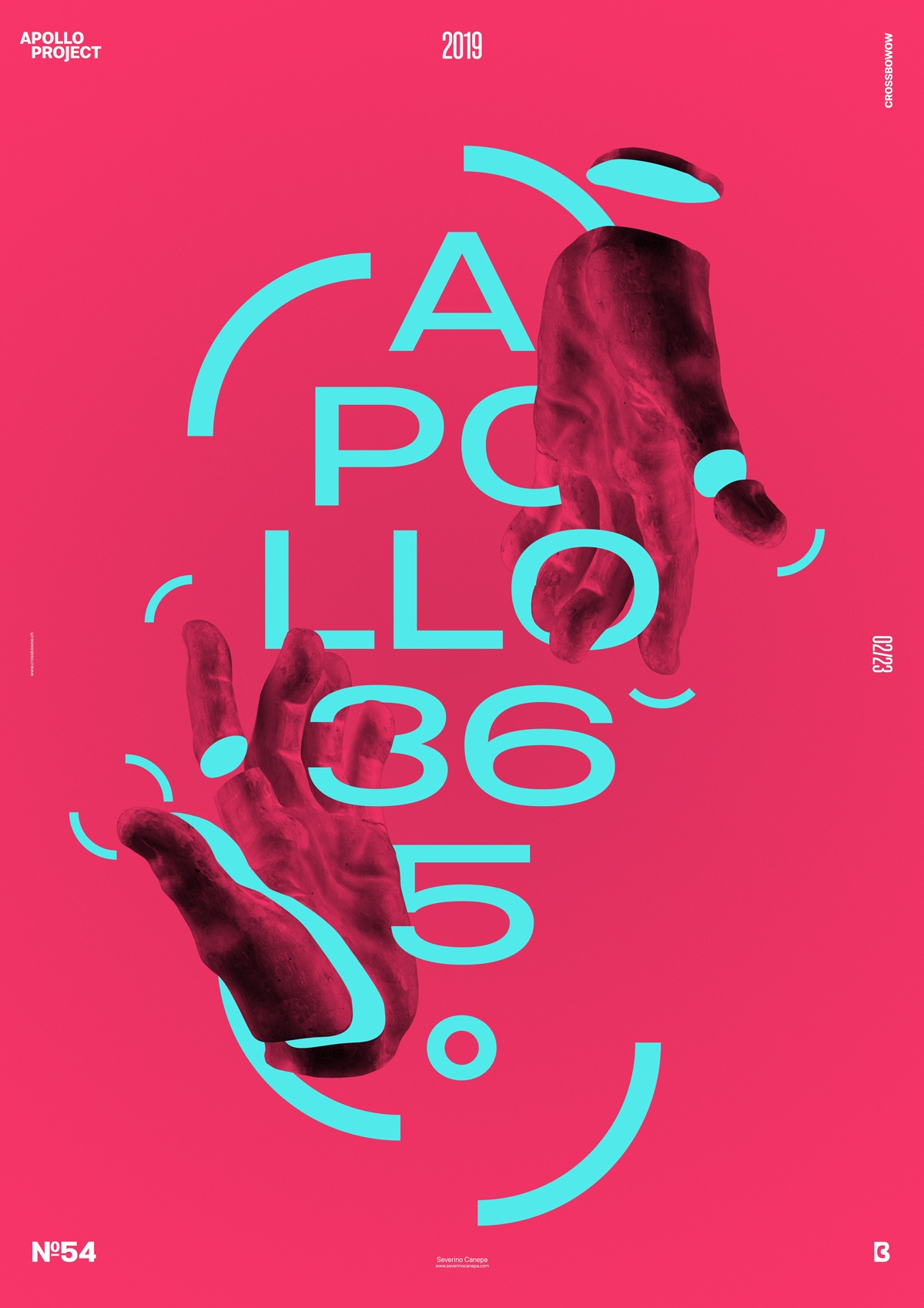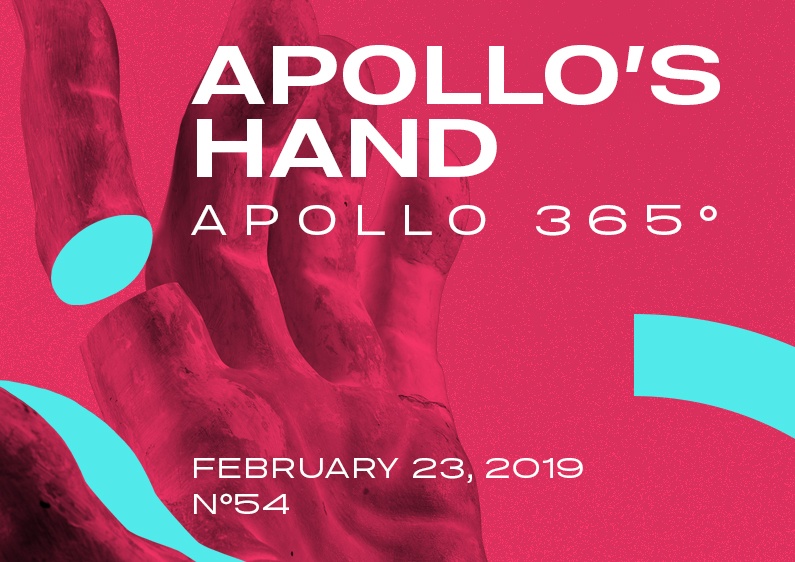
Working on poster design #54 was a tough day for a mitigated result. I feel I opened some new ways to explore this Poster without resolving its visual problems. If I isolate the colors individually and look at them, they are nice colors. Together, they are an attraction and a rejection at the same time. That’s my feeling about them.
The problem seems to come from the white areas of the hand, which melt too much with the background. Whatever the result is, I am not convinced. On the other hand, I am not entirely disappointed. There are some underdeveloped ideas.

Apollo’s Hand Speed Art Poster
It was a tough day, but I am happy it’s done now. I enjoyed creating this poster, but making decisions about the final details became difficult.
One more poster! I hope you will enjoy watching and working on it.
Have a nice day, and see you for the #55 tomorrow!

