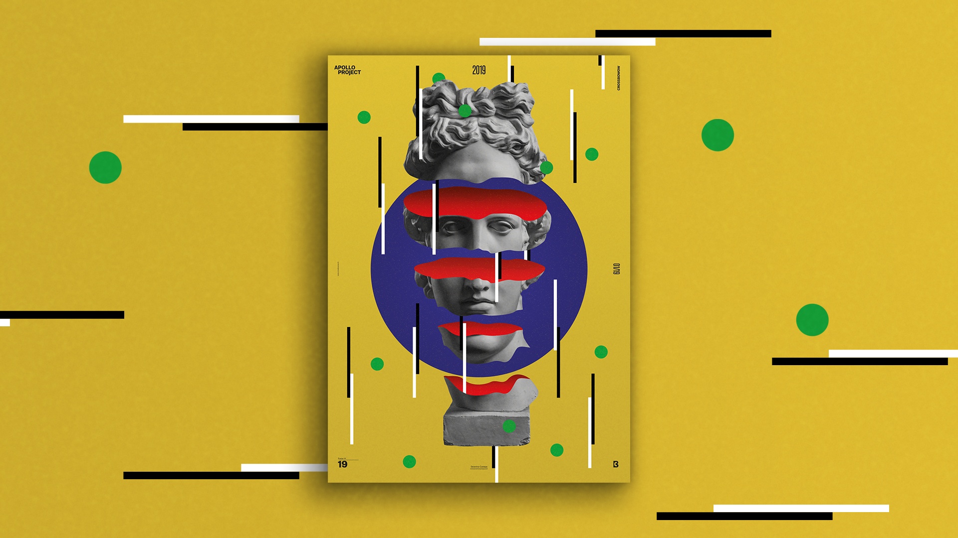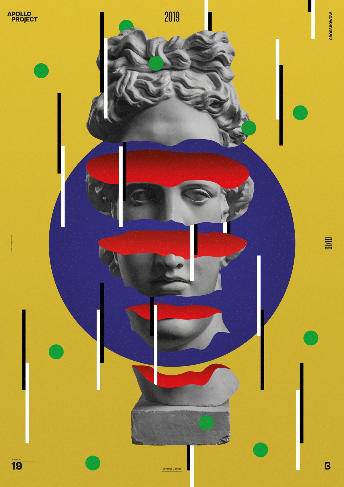
This is another poster design in which I let my mind go everywhere it wants without any goals or expectations. That was only the beginning. The more forms I add, the more I estimate the composition balance and the more that raises questions about my graphic design capacities.
About Primary Poster Design #19

These days, I want to cut Apollo’s head. I think it’s because of the zeitgeist trend of the current Poster Design. I used a bloody color inside without really noticing the meaning. I was thinking in terms of colors and not in terms of meaning. After cutting Appolo’s head, I made a big blue circle with a noisy layer above and a noisy yellow background.
To finalize, I used black & white lines and green circles as a pattern everywhere around.
Primary Conception
Making Off
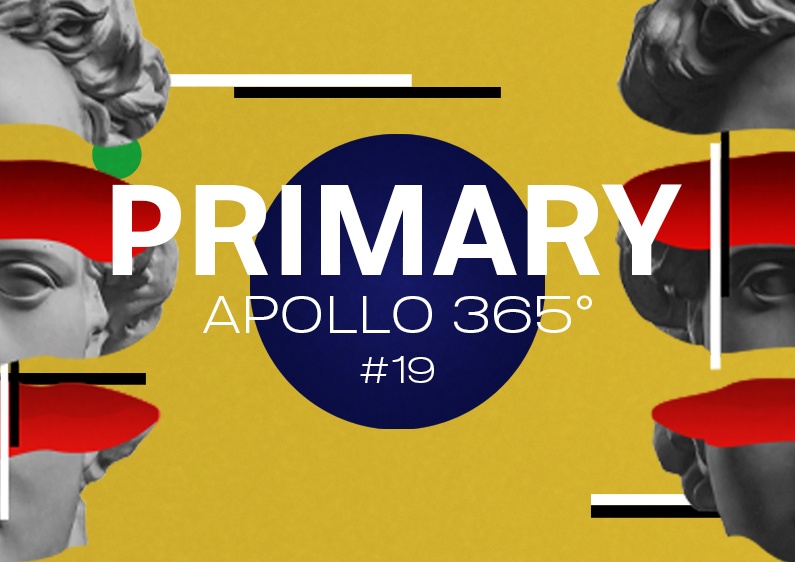
Here is the conception video of the Poster Design “Primary.” Post-production went smoothly once, and it didn’t take me hours to compress the files.
I hope you will enjoy watching me working on my process as much as I enjoy making it.
As a final word, see you tomorrow for the number 21.

