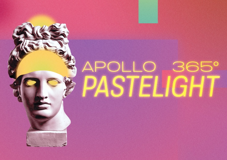
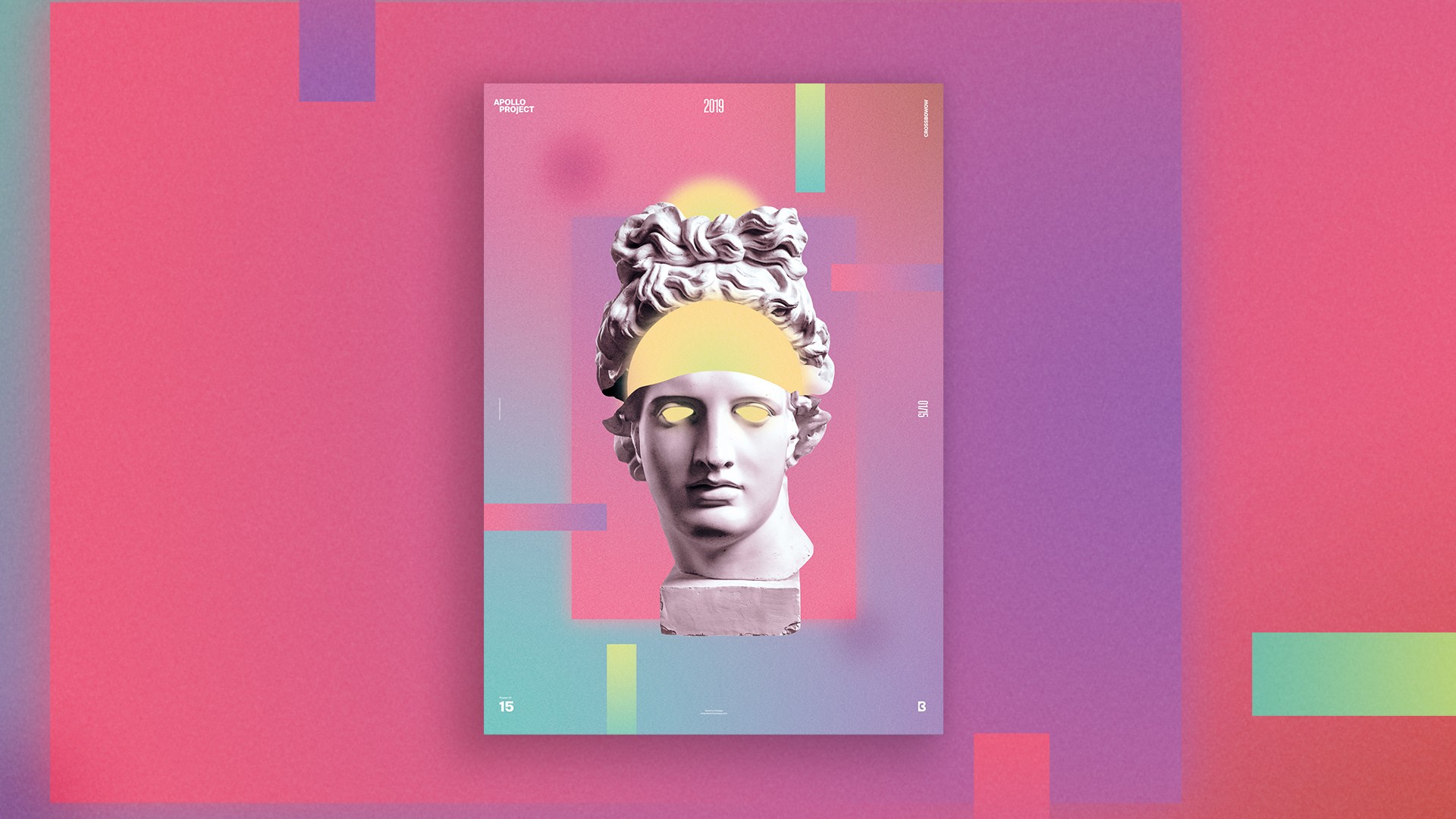
For Poster Design #15, I wanted to use Pastel colors. They are visually sweet and well known for soothing irritated graphic designers’ eyes.
About The Poster Design #15
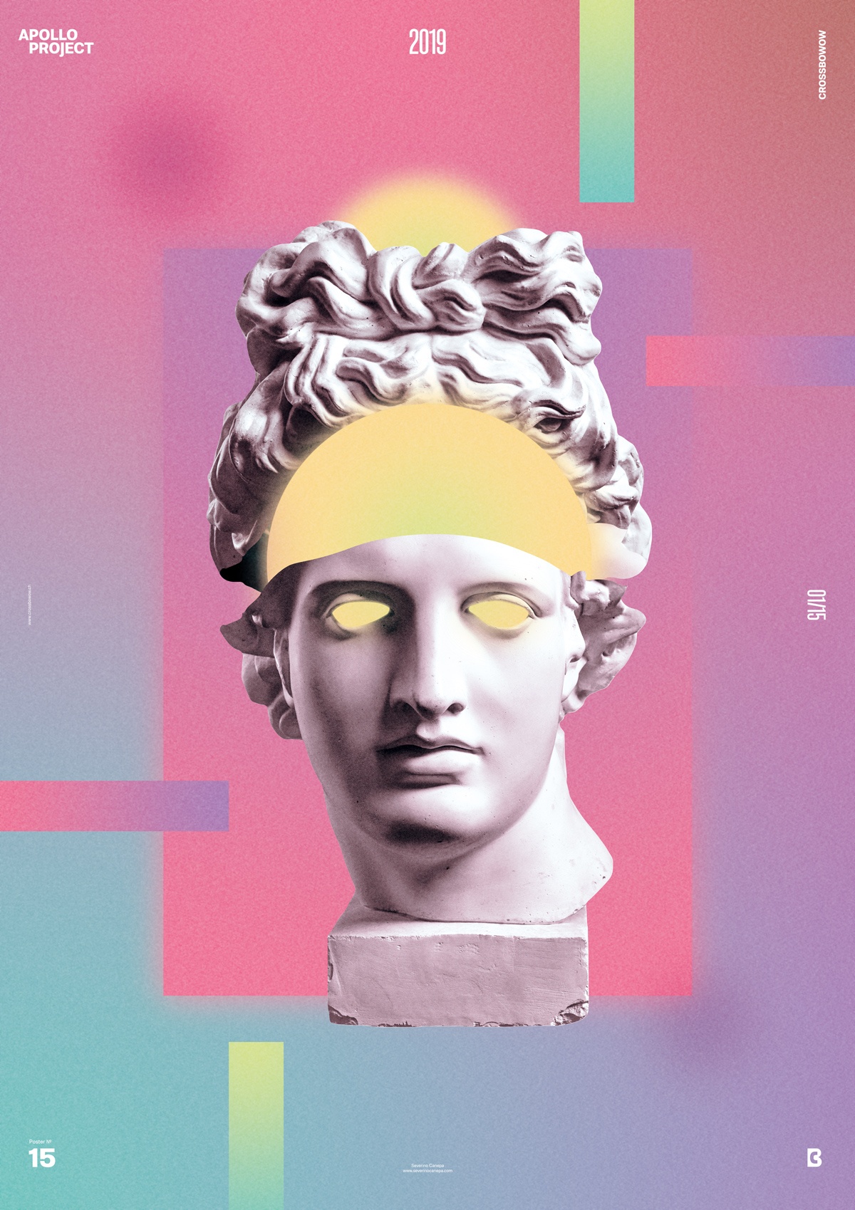
Pursuing this affirmation, I started by cutting out Appolo’s head, and a surgeon would chop inside the flesh. While doing this, I felt I should show what looked like Apollo’s brain.
I quickly selected many pastel colors, which I played with and applied with a linear warm gradient for the background and a green radial gradient with transparency for the bottom left.
I finally applied a little noise transparency on the top of my layers to unify the elements.
Apollo looks like a biblical representation with its aureole above its head. I noticed a while after I made it.
Pastelight Creation
Making Off
Today’s Poster Design was satisfying in terms of design, compositions with geometric forms, and the time it took to work on “Pastelight.”
As I always said, I hope you will enjoy watching the poster design come to life and that it will inspire you! See you tomorrow for number 16.