A Word about the Design
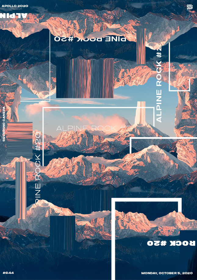
I have to say that I am sad. I am sad because Alpine Rock #20 is the last poster of the mini-series. I improved them not so long ago with the abstract element I added.
I also like the global feel of improving the picture of the mountain; it becomes a surrealist artwork.
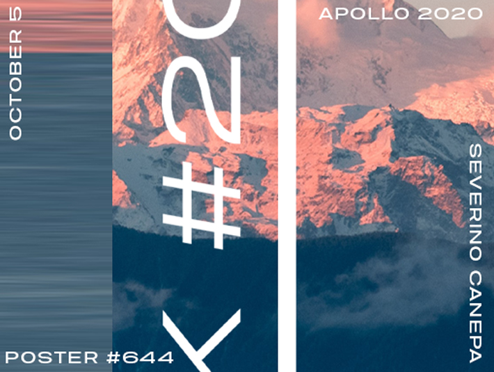
The mix of abstract and figurative elements is nearly perfect. The mountain is an organic shape made of triangles, and the extended part represents the abstract shape, a rectangle. Maybe I will continue with that style of posters. It was also a challenge to improve some of the styles I made or styles that inspired me; I reached one of my goals!

